 時間序列分析和預測基礎理論知識
今天給大家帶來一篇實戰案例,本案例旨在運用之前學習的時間序列分析和預測基礎理論知識,用一個基于交通數據的實際案例數據演示這些方法是如何被應用的。
本文主要內容
★ 首先使用探索性數據分析,從不同時間維度探索分析交通系統乘客數量。
★ 創建一個函數來檢查時間序列數據的平穩性,通過一階差分將非平穩性數據轉化為平穩性數據。
★ 然后將數據分為訓練集和驗證集,簡單介紹了并應用多個時間序列預測技術,如樸素法、移動平均方法、簡單指數平滑、霍爾特線性趨勢法、霍爾特-溫特法、ARIMA和SARIMAX模型。
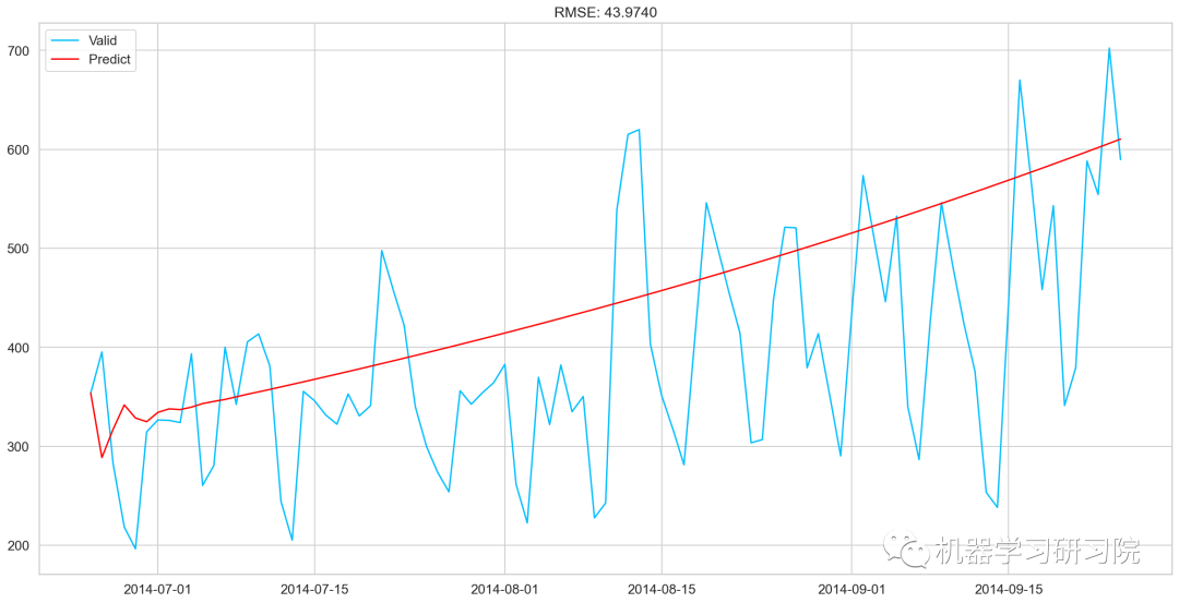
★ 最后使用SARIMAX模型預測未來7個月的流量,因為它有最小的RMSE。如下圖所示,藍色線是訓練數據,黃色線是驗證數據,紅色是使用SARIMAX模型預測的數據。

雖然擬合最好的SARIMAX模型,但似乎也沒那么棒,當然會有更好的方法來預測該數據。而本文重點是介紹這些基于統計學的經典時間序列預測技術在實際案例中的應用。

導入相關模塊
importpandasaspd
importnumpyasnp
importmatplotlib.pyplotasplt
fromdatetimeimportdatetime
frompandasimportSeries
fromsklearn.metricsimportmean_squared_error
frommathimportsqrt
fromstatsmodels.tsa.seasonalimportseasonal_decompose
importstatsmodels
importstatsmodels.apiassm
fromstatsmodels.tsa.arima_modelimportARIMA
數據集準備
去直接讀取用pandas讀取csv文本文件,并拷貝一份以備用。
train=pd.read_csv("Train.csv")
test=pd.read_csv("Test.csv")

train_org=train.copy()
test_org=test.copy()
查看數據的列名
train.columns,test.columns
(Index(['ID', 'Datetime', 'Count'], dtype='object'),
 Index(['ID', 'Datetime'], dtype='object'))
查看數據類型
train.dtypes,test.dtypes
(ID           int64
 Datetime    object
 Count        int64
 dtype: object,
 ID           int64
 Datetime    object
 dtype: object)
查看數據大小
test.shape,train.shape
((5112, 2), (18288, 3))
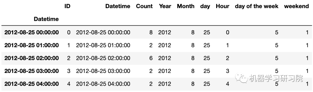
查看數據樣貌
train.head()
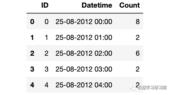
解析日期格式
train['Datetime']=pd.to_datetime(train.Datetime,format='%d-%m-%Y%H:%M')
test['Datetime']=pd.to_datetime(test.Datetime,format='%d-%m-%Y%H:%M')
test_org['Datetime']=pd.to_datetime(test_org.Datetime,format='%d-%m-%Y%H:%M')
train_org['Datetime']=pd.to_datetime(train_org.Datetime,format='%d-%m-%Y%H:%M')
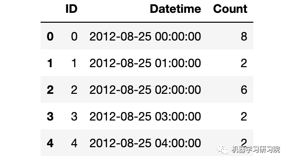
時間日期格式解析結束后,記得查看下結果。
train.dtypes
ID                   int64
Datetime    datetime64[ns]
Count                int64
dtype: object
train.head()
時間序列數據的特征工程
時間序列的特征工程一般可以分為以下幾類。本次案例我們根據實際情況,選用時間戳衍生時間特征。

時間戳雖然只有一列,但是也可以根據這個就衍生出很多很多變量了,具體可以分為三大類:時間特征、布爾特征,時間差特征。
本案例首先對日期時間進行時間特征處理,而時間特征包括年、季度、月、周、天(一年、一月、一周的第幾天)、小時、分鐘...
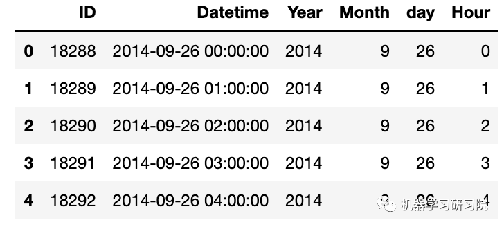
因為需要對test, train, test_org, train_org四個數據框進行同樣的處理,直接使用for循環批量提取年月日小時等特征。
foriin(test,train,test_org,train_org):
i['Year']=i.Datetime.dt.year
i['Month']=i.Datetime.dt.month
i['day']=i.Datetime.dt.day
i['Hour']=i.Datetime.dt.hour
#i["dayoftheweek"]=i.Datetime.dt.dayofweek
test.head()
時間戳衍生中,另一常用的方法為布爾特征,即:
是否年初/年末
是否月初/月末
是否周末
是否節假日
是否特殊日期
是否早上/中午/晚上
等等
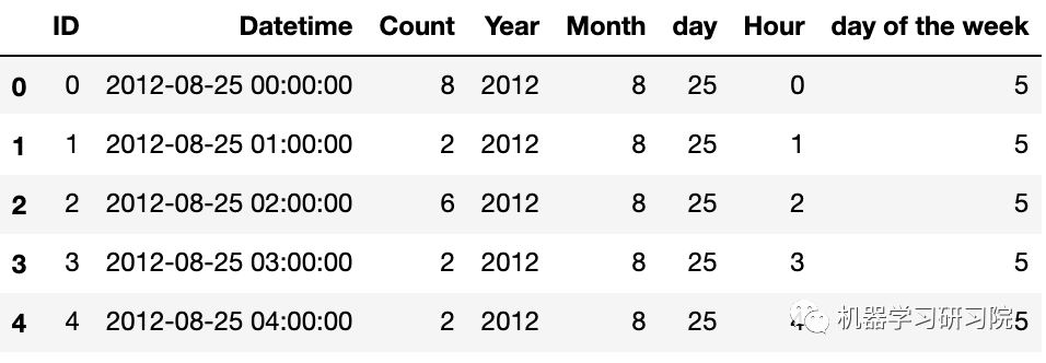
下面判斷是否是周末,進行特征衍生的布爾特征轉換。首先提取出日期時間的星期幾。
train['dayoftheweek']=train.Datetime.dt.dayofweek
#返回給定日期時間的星期幾
train.head()
再判斷day of the week是否是周末(星期六和星期日),是則返回1 ,否則返回0
defapplyer(row):
ifrow.dayofweek==5orrow.dayofweek==6:
return1
else:
return0
temp=train['Datetime']
temp2=train.Datetime.apply(applyer)
train['weekend']=temp2
train.index=train['Datetime']
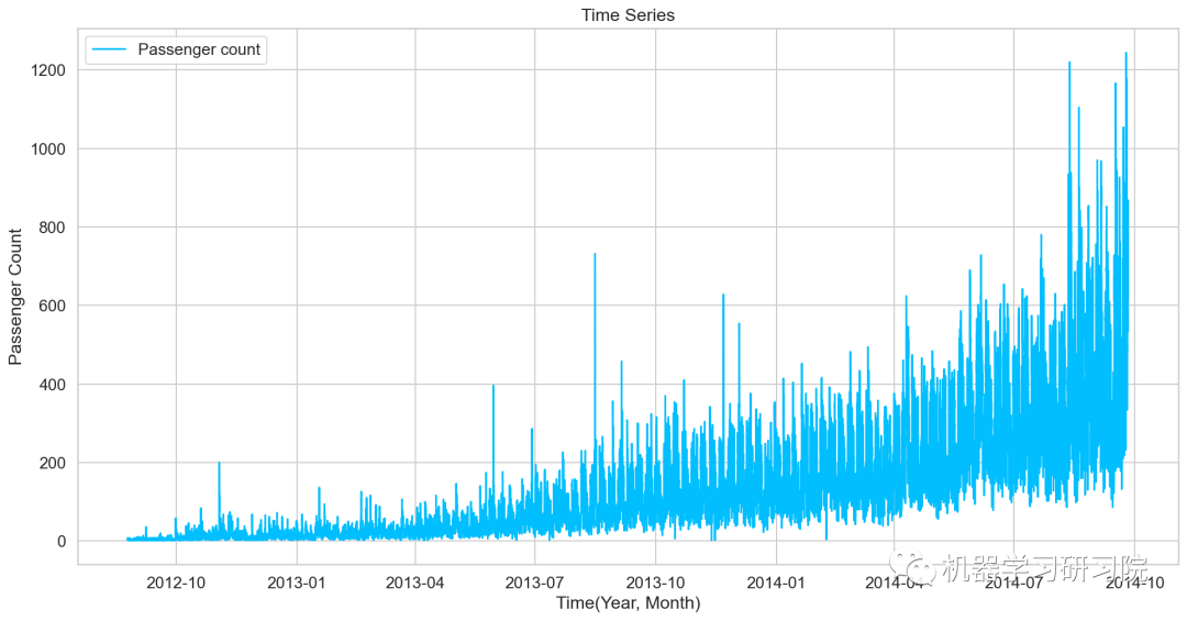
對年月乘客總數統計后可視化,看看總體變化趨勢。
df=train.drop('ID',1)
ts=df['Count']
plt.plot(ts,label='Passengercount')
探索性數據分析
首先使用探索性數據分析,從不同時間維度探索分析交通系統乘客數量。
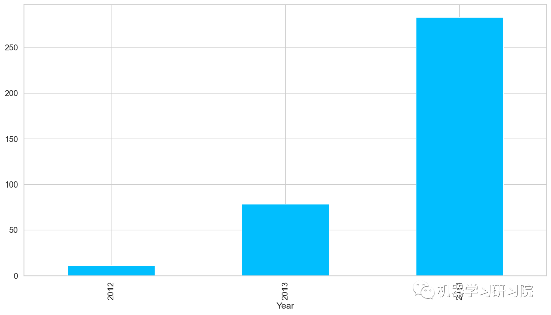
年
對年進行聚合,求所有數據中按年計算的每日平均客流量,從圖中可以看出,隨著時間的增長,每日平均客流量增長迅速。
train.groupby('Year')['Count'].mean().plot.bar()
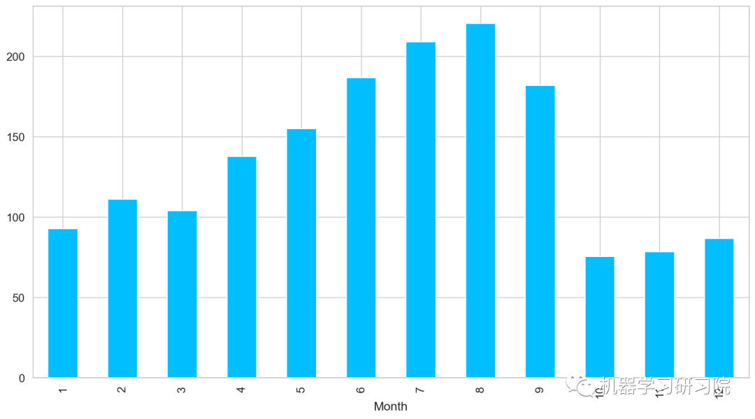
月
對月份進行聚合,求所有數據中按月計算的每日平均客流量,從圖中可以看出,春夏季客流量每月攀升,而秋冬季客流量驟減。
train.groupby('Month')['Count'].mean().plot.bar()
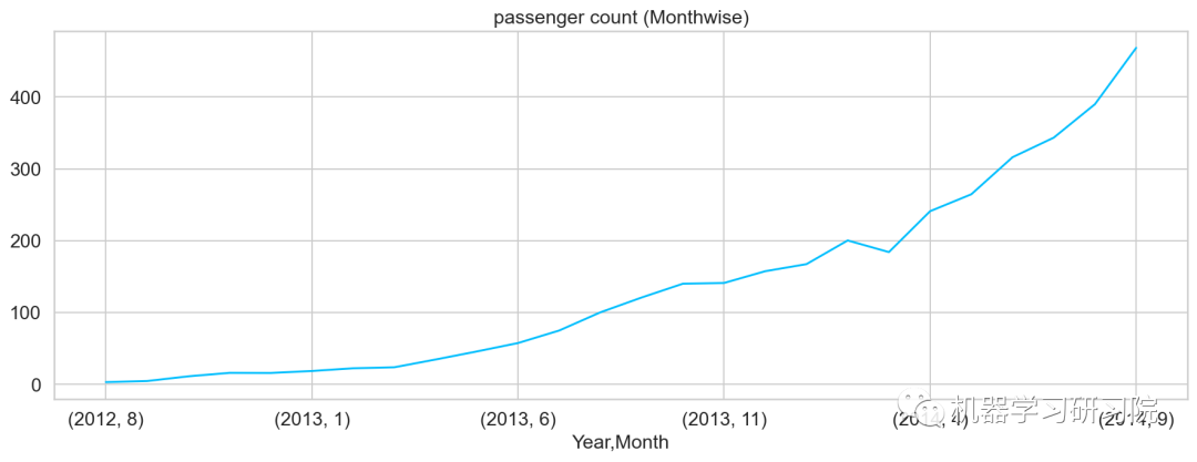
年月
對年月份進行聚合,求所有數據中按年月計算的每日平均客流量,從圖可知道,幾本是按照平滑指數上升的趨勢。
temp=train.groupby(['Year','Month'])['Count'].mean()
temp.plot()#乘客人數(每月)
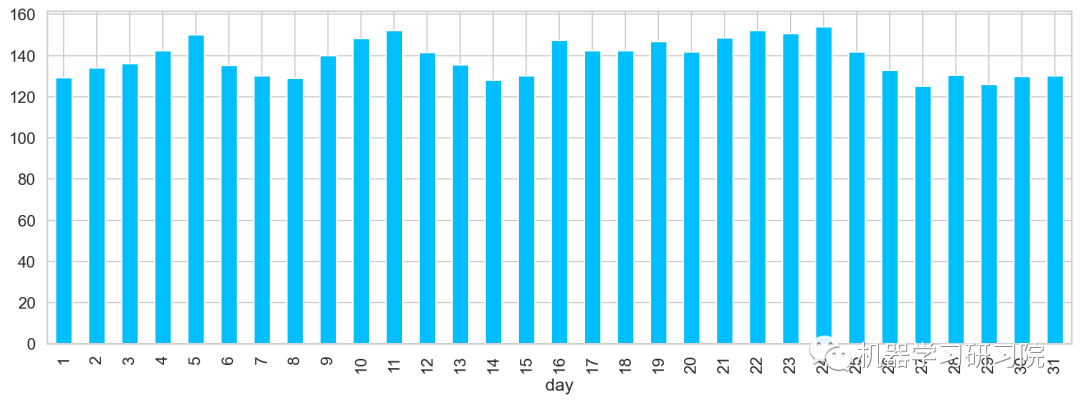
日
對日進行聚合,求所有數據中每月中的每日平均客流量。從圖中可大致看出,在5、11、24分別出現三個峰值,該峰值代表了上中旬的高峰期。
train.groupby('day')['Count'].mean(
).plot.bar(figsize=(15,5))
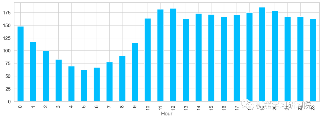
小時
對小時進行聚合,求所有數據中一天內按小時計算的平均客流量,得到了在中(12)晚(19)分別出現兩個峰值,該峰值代表了每日的高峰期。
train.groupby('Hour')['Count'].mean().plot.bar()
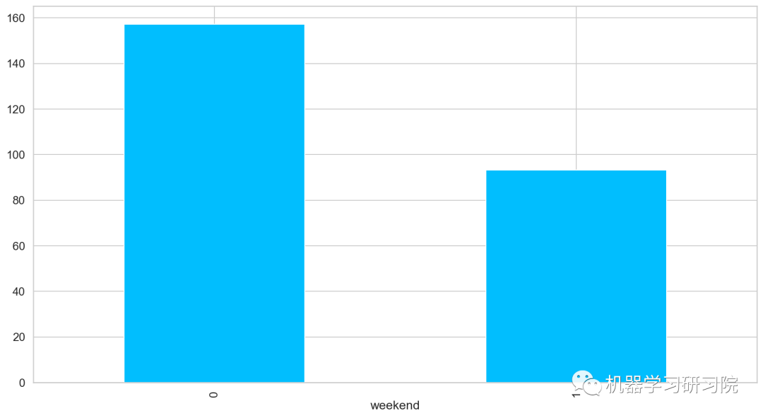
是否周末
對是否是周末進行聚合,求所有數據中按是否周末計算的平均客流量,發現工作日比周末客流量客流量多近一倍,果然大家都是周末都喜歡宅在家里。
train.groupby('weekend')['Count'].mean().plot.bar()
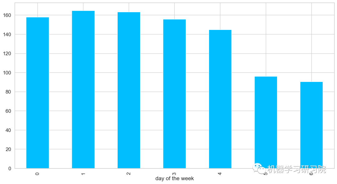
周
對星期進行聚合統計,求所有數據中按是周計算的平均客流量。
train.groupby('dayoftheweek')['Count'].mean().plot.bar()
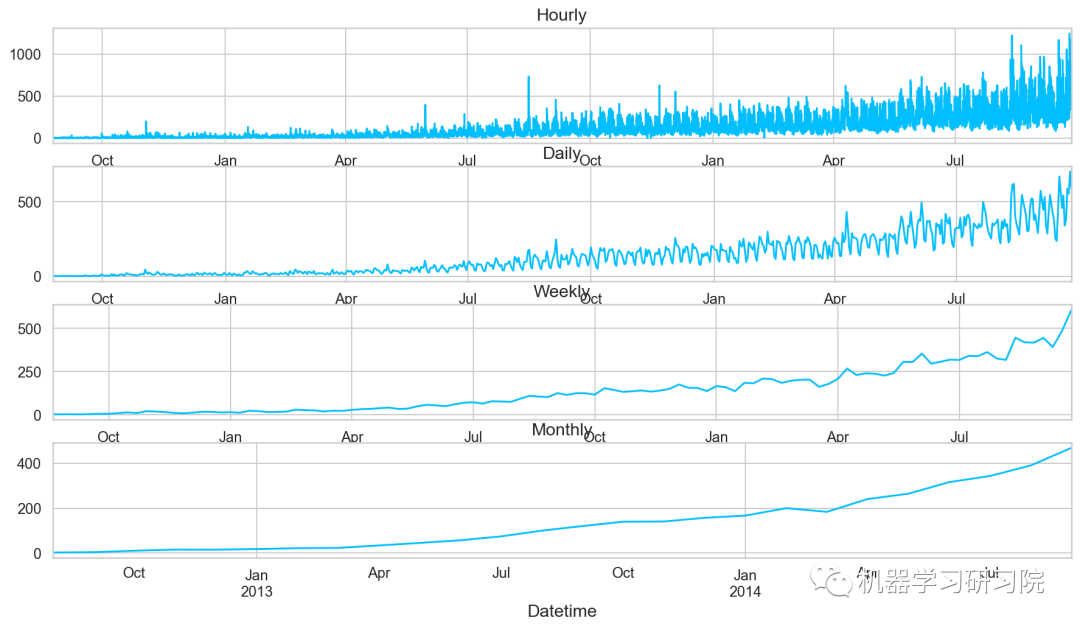
時間重采樣
◎重采樣(resampling)指的是將時間序列從一個頻率轉換到另一個頻率的處理過程;
◎ 將高頻率數據聚合到低頻率稱為降采樣(downsampling);
◎ 將低頻率數據轉換到高頻率則稱為升采樣(unsampling);
train.head()
Pandas中的resample,重新采樣,是對原樣本重新處理的一個方法,是一個對常規時間序列數據重新采樣和頻率轉換的便捷的方法。
Resample方法的主要參數,如需要了解詳情,可以戳這里了解更多。
| 參數 | 說明 |
|---|---|
| freq | 表示重采樣頻率,例如'M'、'5min'、Second(15) |
| how='mean' | 用于產生聚合值的函數名或數組函數,例如'mean'、'ohlc'、np.max等,默認是'mean',其他常用的值由:'first'、'last'、'median'、'max'、'min' |
| axis=0 | 默認是縱軸,橫軸設置axis=1 |
接下來對訓練數據進行對月、周、日及小時多重采樣。其實我們分月份進行采樣,然后求月內的均值。事實上重采樣,就相當于groupby,只不過是根據月份這個period進行分組。
train=train.drop('ID',1)
train.timestamp=pd.to_datetime(train.Datetime,format='%d-%m-%Y%H:%M')
train.index=train.timestamp

#每小時的時間序列
hourly=train.resample('H').mean()
#換算成日平均值
daily=train.resample('D').mean()
#換算成周平均值
weekly=train.resample('W').mean()
#換算成月平均值
monthly=train.resample('M').mean()
重采樣后對其進行可視化,直觀地看看其變化趨勢。
對測試數據也進行相同的時間重采樣處理。
test.Timestamp=pd.to_datetime(test.Datetime,format='%d-%m-%Y%H:%M')
test.index=test.Timestamp
#換算成日平均值
test=test.resample('D').mean()
train.Timestamp=pd.to_datetime(train.Datetime,format='%d-%m-%Y%H:%M')
train.index=train.Timestamp

#C換算成日平均值
train=train.resample('D').mean()
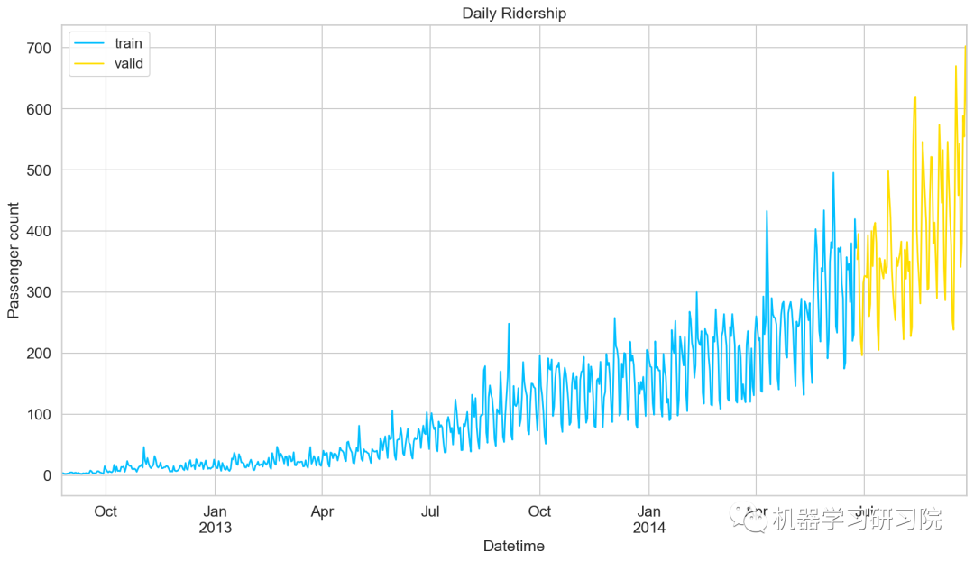
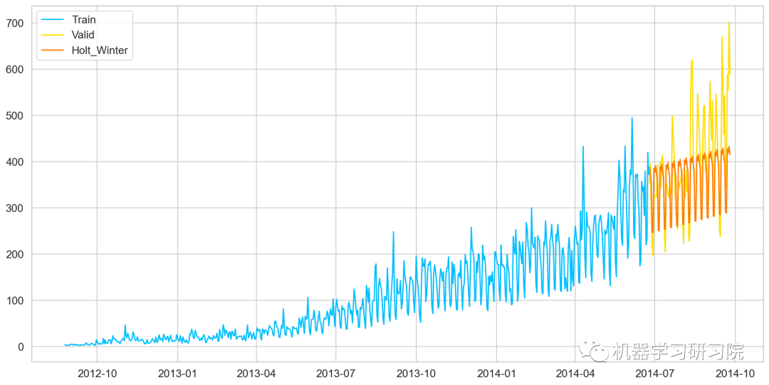
劃分訓練集和驗證集
到目前為止,我們有訓練集和測試集,實際上,我們還需要一個驗證集,用來實時驗證和調整訓練模型。下面直接用索引切片的方式做處理。
Train=train.loc['2012-08-25':'2014-06-24']
valid=train['2014-06-25':'2014-09-25']
劃分好數據集后,繪制折線圖將訓練集和驗證集進行可視化。
模型建立
數據準備好了,就到了模型建立階段,這里我們應用多個時間序列預測技術,如樸素法、移動平均方法、簡單指數平滑、霍爾特線性趨勢法、霍爾特-溫特法、ARIMA和SARIMAX模型。
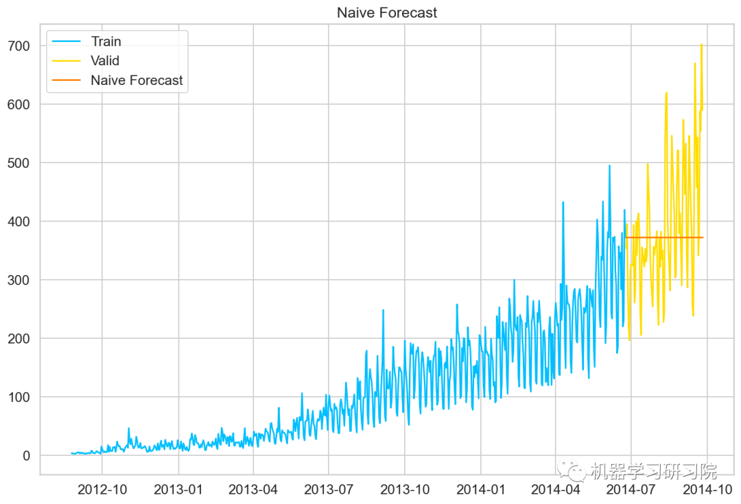
樸素預測法
如果數據集在一段時間內都很穩定,我們想預測第二天的價格,可以取前面一天的價格,預測第二天的值。這種假設第一個預測點和上一個觀察點相等的預測方法就叫樸素預測法(Naive Forecast),即。
因為樸素預測法用最近的觀測值作為預測值,因此他最簡單的預測方法。雖然樸素預測法并不是一個很好的預測方法,但是它可以為其他預測方法提供一個基準。
dd=np.asarray(Train.Count)
#將結構數據轉化為ndarray
y_hat=valid.copy()
y_hat['naive']=dd[len(dd)-1]
plt.plot(Train.index,Train['Count'],label='Train')
plt.plot(valid.index,valid['Count'],label='Valid')
plt.plot(y_hat.index,y_hat['naive'],label='NaiveForecast')
模型評價
用RMSE檢驗樸素法的的準確率
rms=sqrt(mean_squared_error(valid.Count,y_hat.naive))
print(rms)
111.79050467496724
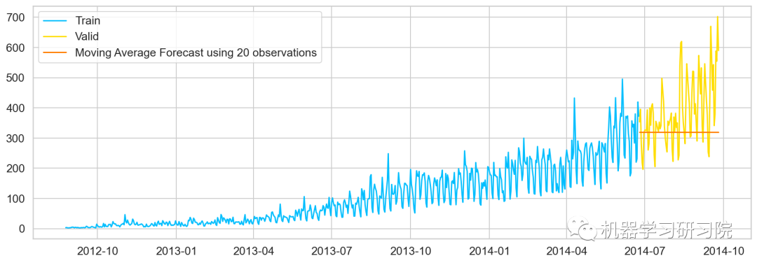
移動平均值法
移動平均法也叫滑動平均法,取前面n個點的平均值作為預測值。
計算移動平均值涉及到一個有時被稱為"滑動窗口"的大小值。使用簡單的移動平均模型,我們可以根據之前數值的固定有限數的平均值預測某個時序中的下一個值。利用一個簡單的移動平均模型,我們預測一個時間序列中的下一個值是基于先前值的固定有限個數“p”的平均值。
這樣,對于所有的
#最近10次觀測的移動平均值,即滑動窗口大小為P=10
y_hat_avg=valid.copy()
y_hat_avg['moving_avg_forecast']=Train['Count'].rolling(10).mean().iloc[-1]

#最近20次觀測的移動平均值
y_hat_avg=valid.copy()
y_hat_avg['moving_avg_forecast']=Train['Count'].rolling(20).mean().iloc[-1]

#最近30次觀測的移動平均值
y_hat_avg=valid.copy()
y_hat_avg['moving_avg_forecast']=Train['Count'].rolling(50).mean().iloc[-1]
plt.plot(Train['Count'],label='Train')
plt.plot(valid['Count'],label='Valid')
plt.plot(y_hat_avg['moving_avg_forecast'],
label='MovingAverageForecastusing50observations')


簡單指數平滑法
介紹這個之前,需要知道什么是簡單平均法(Simple Average),該方法預測的期望值等于所有先前觀測點的平均值。
物品價格會隨機上漲和下跌,平均價格會保持一致。我們經常會遇到一些數據集,雖然在一定時期內出現小幅變動,但每個時間段的平均值確實保持不變。這種情況下,我們可以認為第二天的價格大致和過去的平均價格值一致。
簡單平均法和加權移動平均法在選取時間點的思路上存在較大的差異:
簡單平均法將過去數據一個不漏地全部加以同等利用;
移動平均法則不考慮較遠期的數據,并在加權移動平均法中給予近期更大的權重。
我們就需要在這兩種方法之間取一個折中的方法,在將所有數據考慮在內的同時也能給數據賦予不同非權重。
簡單指數平滑法 (Simple Exponential Smoothing)相比更早時期內的觀測值,越近的觀測值會被賦予更大的權重,而時間越久遠的權重越小。它通過加權平均值計算出預測值,其中權重隨著觀測值從早期到晚期的變化呈指數級下降,最小的權重和最早的觀測值相關:
其中是平滑參數。
fromstatsmodels.tsa.apiimportExponentialSmoothing,SimpleExpSmoothing,Holt
y_hat_avg=valid.copy()
fit2=SimpleExpSmoothing(np.asarray(Train['Count'])).fit(smoothing_level=0.6,optimized=False)
y_hat_avg['SES']=fit2.forecast(len(valid))
plt.figure(figsize=(16,8))
plt.plot(Train['Count'],label='Train')
plt.plot(valid['Count'],label='Valid')
plt.plot(y_hat_avg['SES'],label='SES')
plt.legend(loc='best')
plt.show()

模型評價
用RMSE檢驗樸素法的的準確率
rms=sqrt(mean_squared_error(valid.Count,y_hat_avg.SES))
print(rms)
113.43708111884514
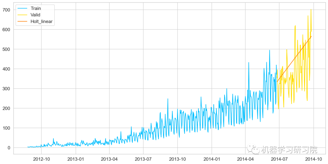
霍爾特線性趨勢法
Holts線性趨勢模型,該方法考慮了數據集的趨勢,即序列的增加或減少性質。
盡管這些方法中的每一種都可以應用趨勢:簡單平均法會假設最后兩點之間的趨勢保持不變,或者我們可以平均所有點之間的所有斜率以獲得平均趨勢,使用移動趨勢平均值或應用指數平滑。但我們需要一種無需任何假設就能準確繪制趨勢圖的方法。這種考慮數據集趨勢的方法稱為霍爾特線性趨勢法,或者霍爾特指數平滑法。
y_hat_avg=valid.copy()
fit1=Holt(np.asarray(Train['Count'])
).fit(smoothing_level=0.3,smoothing_slope=0.1)
y_hat_avg['Holt_linear']=fit1.forecast(len(valid))

plt.plot(Train['Count'],label='Train')
plt.plot(valid['Count'],label='Valid')
plt.plot(y_hat_avg['Holt_linear'],label='Holt_linear')
模型評價
用RMSE檢驗樸素法的的準確率
rms=sqrt(mean_squared_error(valid.Count,y_hat_avg.Holt_linear))
print(rms)
112.94278345314041
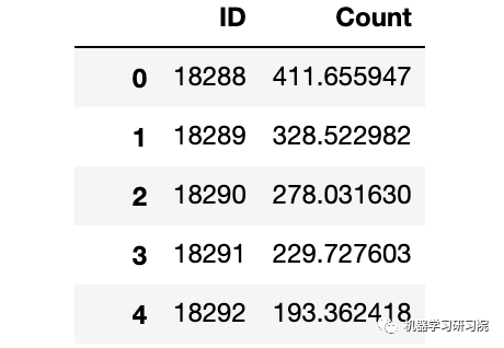
由于holts線性趨勢,到目前為止具有最好的準確性,我們嘗試使用它來預測測試數據集。
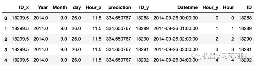
predict=fit1.forecast(len(test))
test['prediction']=predict
#計算每小時計數的比率
train_org['ratio']=train_org['Count']/train_org['Count'].sum()
#按小時計數分組
temp=train_org.groupby(['Hour'])['ratio'].sum()
#保存聚合后的數據
pd.DataFrame(temp,columns=['ratio']).to_csv('GROUPBY.csv')

temp2=pd.read_csv('GROUPBY.csv')
#按日、月、年合并test和test_org
merge=pd.merge(test,test_org,on=('day','Month','Year'),how='left')
merge['Hour']=merge['Hour_y']
merge['ID']=merge['ID_y']
merge.head()
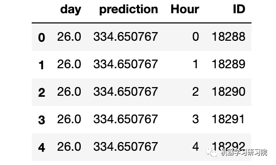
刪除不需要的特征。
merge=merge.drop(['Year','Month','Datetime','Hour_x','Hour_y','ID_x','ID_y'],axis=1)
merge.head()
通過合并merge和temp2進行預測。
prediction=pd.merge(merge,temp2,on='Hour',how='left')
#將比率轉換成原始比例
prediction['Count']=prediction['prediction']*prediction['ratio']*24
submission=prediction
pd.DataFrame(submission,columns=['ID','Count']).to_csv('Holt_Linear.csv')
霍爾特-溫特法
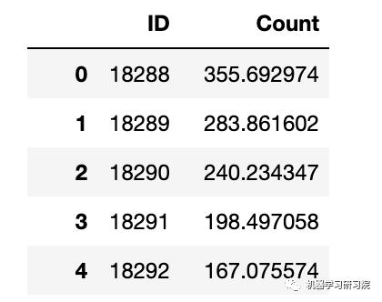
霍爾特-溫特(Holt-Winters)方法,在 Holt模型基礎上引入了 Winters 周期項(也叫做季節項),可以用來處理月度數據(周期 12)、季度數據(周期 4)、星期數據(周期 7)等時間序列中的固定周期的波動行為。引入多個 Winters 項還可以處理多種周期并存的情況。
#HoltsWintermodel
y_hat_avg=valid.copy()
fit1=ExponentialSmoothing(np.asarray(Train['Count']),seasonal_periods=7,trend='add',seasonal='add',).fit()
y_hat_avg['Holts_Winter']=fit1.forecast(len(valid))
plt.plot(Train['Count'],label='Train')
plt.plot(valid['Count'],label='Valid')
plt.plot(y_hat_avg['Holts_Winter'],label='Holt_Winter')
模型評價
用RMSE檢驗樸素法的的準確率
rms=sqrt(mean_squared_error(valid.Count,y_hat_avg.Holts_Winter))
print(rms)
82.37292653831038
模型預測
predict=fit1.forecast(len(test))
test['prediction']=predict
#按日、月、年合并Test和test_original
merge=pd.merge(test,test_org,on=('day','Month','Year'),how='left')
merge['Hour']=merge['Hour_y']
merge=merge.drop(['Year','Month','Datetime','Hour_x','Hour_y'],axis=1)
#通過合并merge和temp2進行預測
prediction=pd.merge(merge,temp2,on='Hour',how='left')
#將比率轉換成原始比例
prediction['Count']=prediction['prediction']*prediction['ratio']*24
prediction['ID']=prediction['ID_y']
submission=prediction.drop(['day','Hour','ratio','prediction','ID_x','ID_y'],axis=1)
#轉換最終提交的csv格式
pd.DataFrame(submission,columns=['ID','Count']).to_csv('Holtwinters.csv')
迪基-福勒檢驗
函數執行迪基-福勒檢驗以確定數據是否為平穩時間序列。
在統計學里,迪基-福勒檢驗(Dickey-Fuller test)可以測試一個自回歸模型是否存在單位根(unit root)。回歸模型可以寫為,是一階差分。測試是否存在單位根等同于測試是否。
因為迪基-福勒檢驗測試的是殘差項,并非原始數據,所以不能用標準t統計量。我們需要用迪基-福勒統計量。
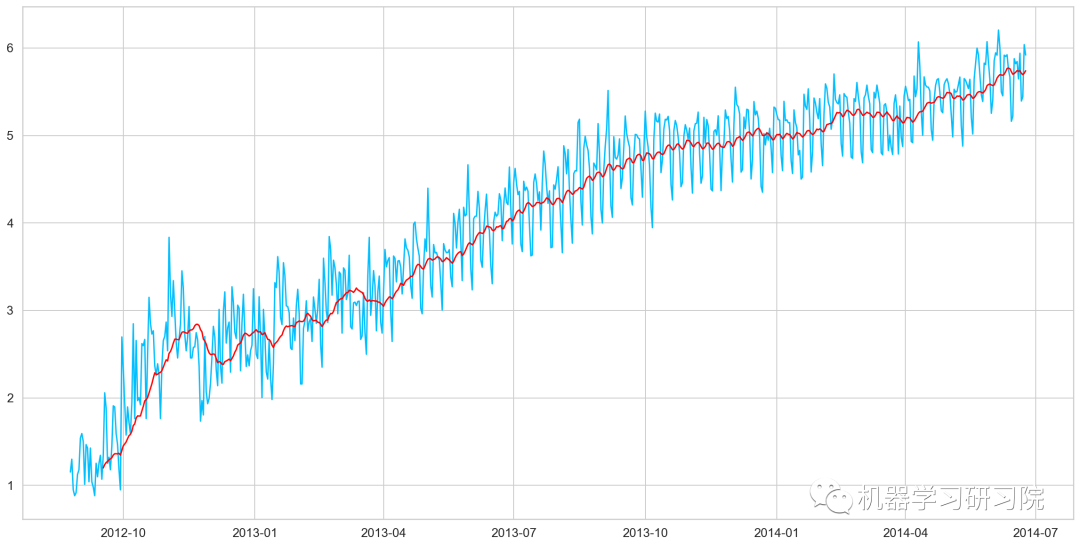
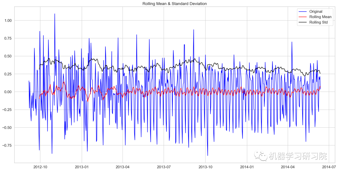
fromstatsmodels.tsa.stattoolsimportadfuller
deftest_stationary(timeseries):
#確定滾動數據
rolmean=timeseries.rolling(24).mean()
rolstd=timeseries.rolling(24).std()

#會議滾動數據
orig=plt.plot(timeseries,color='blue',label='Original')
mean=plt.plot(rolmean,color='red',label='RollingMean')
std=plt.plot(rolstd,color='black',label='RollingStd')
plt.legend(loc='best')
plt.title('RollingMean&StandardDeviation')
plt.show(block=False)

#執行迪基-福勒檢驗
print('ResultsofDickey-FullerTest:')
dftest=adfuller(timeseries,autolag='AIC')
dfoutput=pd.Series(dftest[0:4],index=['TestStatistic','P-value','#lagsused','NoofObservationsused'])
forkey,valueindftest[4].items():
dfoutput['CriticalValue(%s)'%key]=value
print(dfoutput)
繪制檢驗圖
test_stationary(train_org['Count'])
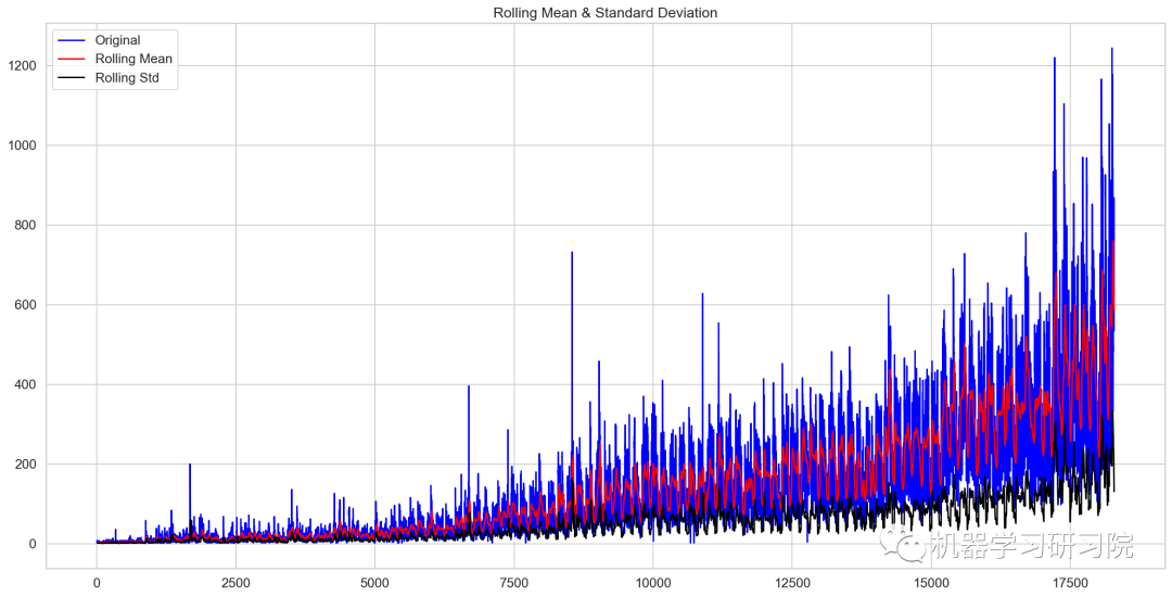
Results of Dickey-Fuller Test:
Test Statistic                -4.456561
P-value                        0.000235
#lags used                    45.000000
No of Observations used    18242.000000
Critical Value (1%)           -3.430709
Critical Value (5%)           -2.861698
Critical Value (10%)          -2.566854
dtype: float64
檢驗統計數據表明,由于p值小于0.05,數據是平穩的。
移動平均值
在統計學中,移動平均(moving average),又稱滑動平均是一種通過創建整個數據集中不同子集的一系列平均數來分析數據點的計算方法。移動平均通常與時間序列數據一起使用,以消除短期波動,突出長期趨勢或周期。
對原始數據求對數。
Train_log=np.log(Train['Count'])
valid_log=np.log(Train['Count'])
Train_log.head()
Datetime
2012-08-25    1.152680
2012-08-26    1.299283
2012-08-27    0.949081
2012-08-28    0.882389
2012-08-29    0.916291
Freq: D, Name: Count, dtype: float64
繪制移動平均值曲線
moving_avg=Train_log.rolling(24).mean()
plt.plot(Train_log)
plt.plot(moving_avg,color='red')
plt.show()
去除移動平均值后再進行迪基-福勒檢驗
train_log_moving_avg_diff=Train_log-moving_avg
train_log_moving_avg_diff.dropna(inplace=True)
test_stationary(train_log_moving_avg_diff)
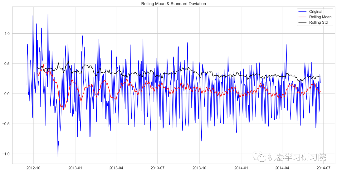
Results of Dickey-Fuller Test:
Test Statistic            -5.861646e+00
P-value                    3.399422e-07
#lags used                 2.000000e+01
No of Observations used    6.250000e+02
Critical Value (1%)       -3.440856e+00
Critical Value (5%)       -2.866175e+00
Critical Value (10%)      -2.569239e+00
dtype: float64
對數時序數據求二階差分后再迪基-福勒檢驗
train_log_diff=Train_log-Train_log.shift(1)
test_stationary(train_log_diff.dropna())
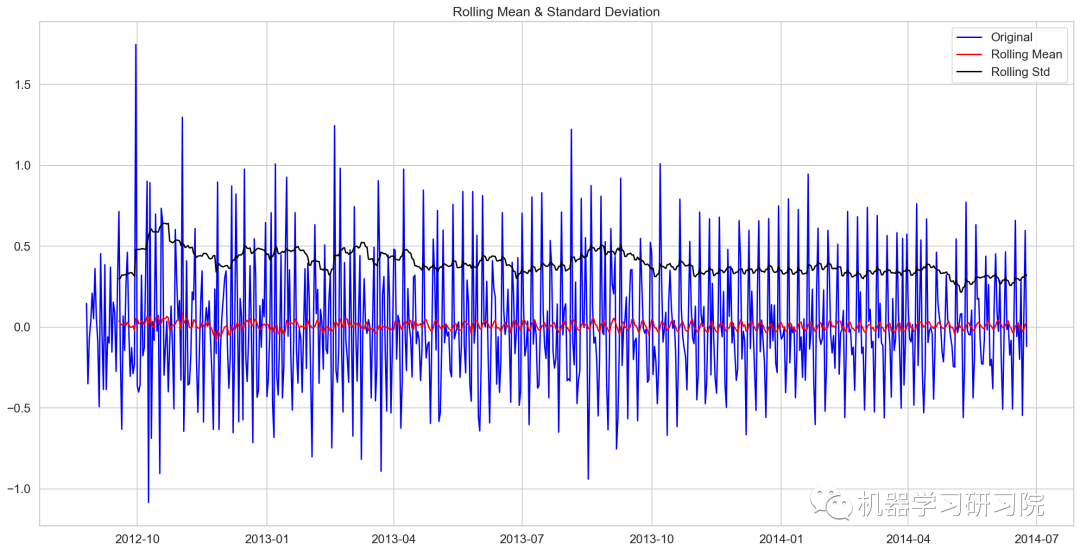
Results of Dickey-Fuller Test:
Test Statistic            -8.237568e+00
P-value                    5.834049e-13
#lags used                 1.900000e+01
No of Observations used    6.480000e+02
Critical Value (1%)       -3.440482e+00
Critical Value (5%)       -2.866011e+00
Critical Value (10%)      -2.569151e+00
dtype: float64
季節性分解
對進行對數轉換后的原始數據進行季節性分解。
decomposition=seasonal_decompose(
pd.DataFrame(Train_log).Count.values,freq=24)
trend=decomposition.trend
seasonal=decomposition.seasonal
residual=decomposition.resid

plt.plot(Train_log,label='Original')
plt.plot(trend,label='Trend')
plt.plot(seasonal,label='Seasonality')
plt.plot(residual,label='Residuals')
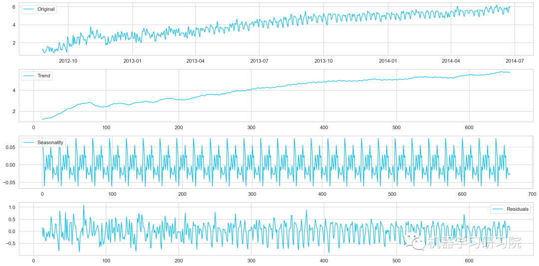
對季節性分解后的殘差數據進行迪基-福勒檢驗
train_log_decompose=pd.DataFrame(residual)
train_log_decompose['date']=Train_log.index
train_log_decompose.set_index('date',inplace=True)
train_log_decompose.dropna(inplace=True)
test_stationary(train_log_decompose[0])
Results of Dickey-Fuller Test:
Test Statistic            -7.822096e+00
P-value                    6.628321e-12
#lags used                 2.000000e+01
No of Observations used    6.240000e+02
Critical Value (1%)       -3.440873e+00
Critical Value (5%)       -2.866183e+00
Critical Value (10%)      -2.569243e+00
dtype: float64
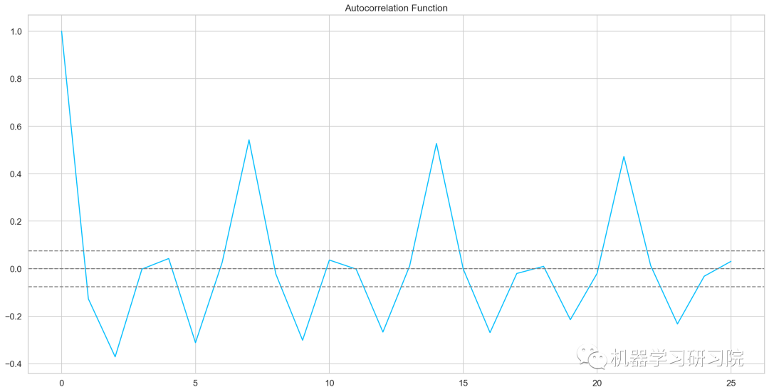
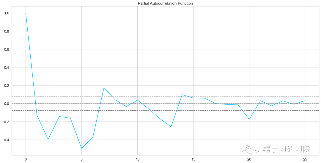
自相關和偏自相關圖
fromstatsmodels.tsa.stattoolsimportacf,pacf
lag_acf=acf(train_log_diff.dropna(),nlags=25)
lag_pacf=pacf(train_log_diff.dropna(),nlags=25,method='ols')
plt.plot(lag_acf)
plt.axhline(y=0,linestyle='--',color='gray')
plt.axhline(y=-1.96/np.sqrt(len(train_log_diff.dropna())),linestyle='--',color='gray')
plt.axhline(y=1.96/np.sqrt(len(train_log_diff.dropna())),linestyle='--',color='gray')
plt.plot(lag_pacf)
plt.axhline(y=0,linestyle='--',color='gray')
plt.axhline(y=-1.96/np.sqrt(len(train_log_diff.dropna())),linestyle='--',color='gray')
plt.axhline(y=1.96/np.sqrt(len(train_log_diff.dropna())),linestyle='--',color='gray')
AR模型
AR模型訓練及預測
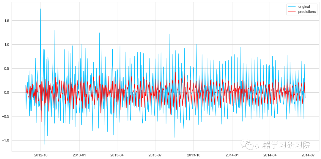
model=ARIMA(Train_log,order=(2,1,0))
#這里q值是零,因為它只是AR模型
results_AR=model.fit(disp=-1)
plt.plot(train_log_diff.dropna(),label='original')
plt.plot(results_AR.fittedvalues,color='red',label='predictions')
AR_predict=results_AR.predict(start="2014-06-25",end="2014-09-25")
AR_predict=AR_predict.cumsum().shift().fillna(0)
AR_predict1=pd.Series(np.ones(valid.shape[0])*np.log(valid['Count'])[0],index=valid.index)
AR_predict1=AR_predict1.add(AR_predict,fill_value=0)
AR_predict=np.exp(AR_predict1)
plt.plot(valid['Count'],label="Valid")
plt.plot(AR_predict,color='red',label="Predict")
plt.legend(loc='best')
plt.title('RMSE:%.4f'%(np.sqrt(np.dot(AR_predict,valid['Count']))/valid.shape[0]))
MA模型
model=ARIMA(Train_log,order=(0,1,2))
#這里的p值是零,因為它只是MA模型
results_MA=model.fit(disp=-1)
plt.plot(train_log_diff.dropna(),label='original')
plt.plot(results_MA.fittedvalues,color='red',label='prediction')
MA_predict=results_MA.predict(start="2014-06-25",end="2014-09-25")
MA_predict=MA_predict.cumsum().shift().fillna(0)
MA_predict1=pd.Series(np.ones(valid.shape[0])*np.log(valid['Count'])[0],index=valid.index)
MA_predict1=MA_predict1.add(MA_predict,fill_value=0)
MA_predict=np.exp(MA_predict1)

plt.plot(valid['Count'],label="Valid")
plt.plot(MA_predict,color='red',label="Predict")
plt.legend(loc='best')
plt.title('RMSE:%.4f'%(np.sqrt(np.dot(MA_predict,valid['Count']))/valid.shape[0]))
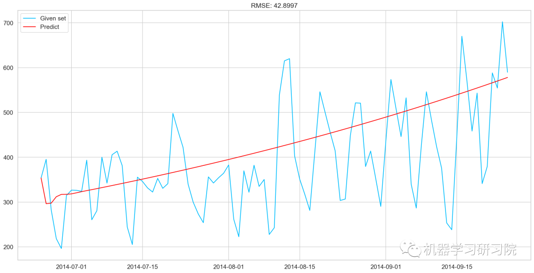
ARMA模型
model=ARIMA(Train_log,order=(2,1,2))
results_ARIMA=model.fit(disp=-1)
plt.plot(train_log_diff.dropna(),label='original')
plt.plot(results_ARIMA.fittedvalues,color='red',label='predicted')
defcheck_prediction_diff(predict_diff,given_set):
predict_diff=predict_diff.cumsum().shift().fillna(0)
predict_base=pd.Series(np.ones(given_set.shape[0])*np.log(given_set['Count'])[0],index=given_set.index)
predict_log=predict_base.add(predict_diff,fill_value=0)
predict=np.exp(predict_log)
plt.plot(given_set['Count'],label="Givenset")
plt.plot(predict,color='red',label="Predict")
plt.legend(loc='best')
plt.title('RMSE:%.4f'%(np.sqrt(np.dot(predict,given_set['Count']))/given_set.shape[0]))
defcheck_prediction_log(predict_log,given_set):
predict=np.exp(predict_log)
plt.plot(given_set['Count'],label="Givenset")
plt.plot(predict,color='red',label="Predict")
plt.legend(loc='best')
plt.title('RMSE:%.4f'%(np.sqrt(np.dot(predict,given_set['Count']))/given_set.shape[0]))
plt.show()
ARIMA_predict_diff=results_ARIMA.predict(start="2014-06-25",
end="2014-09-25")
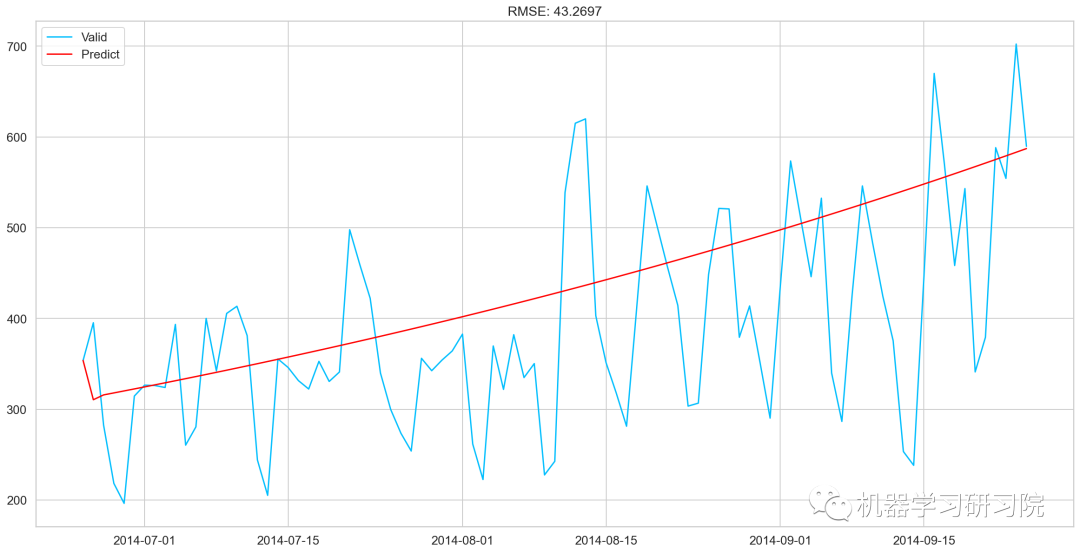
check_prediction_diff(ARIMA_predict_diff,valid)
SARIMAX模型
y_hat_avg=valid.copy()
fit1=sm.tsa.statespace.SARIMAX(Train.Count,order=(2,1,4),seasonal_order=(0,1,1,7)).fit()
y_hat_avg['SARIMA']=fit1.predict(start="2014-6-25",end="2014-9-25",dynamic=True)
plt.plot(Train['Count'],label='Train')
plt.plot(valid['Count'],label='Valid')
plt.plot(y_hat_avg['SARIMA'],label='SARIMA')
模型評價
rms=sqrt(mean_squared_error(valid.Count,y_hat_avg.SARIMA))
print(rms)
70.26240839723575
預測
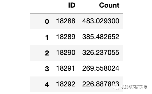
predict=fit1.predict(start="2014-9-26",end="2015-4-26",dynamic=True)
test['prediction']=predict
#按日、月、年合并Test和test_original
merge=pd.merge(test,test_org,on=('day','Month','Year'),how='left')
merge['Hour']=merge['Hour_y']
merge=merge.drop(['Year','Month','Datetime','Hour_x','Hour_y'],axis=1
#通過合并merge和temp2進行預測
prediction=pd.merge(merge,temp2,on='Hour',how='left')
#將比率轉換成原始比例
prediction['Count']=prediction['prediction']*prediction['ratio']*24
prediction['ID']=prediction['ID_y']
submission=prediction.drop(['day','Hour','ratio','prediction','ID_x','ID_y'],axis=1)
#轉換最終提交的csv格式
pd.DataFrame(submission,columns=['ID','Count']).to_csv('SARIMAX.csv')
原文標題:時間序列分析和預測實戰
文章出處:【微信公眾號:數據分析與開發】歡迎添加關注!文章轉載請注明出處。
-
數據
+關注
關注
8文章
7139瀏覽量
89565 -
函數
+關注
關注
3文章
4346瀏覽量
62968 -
時間序列
+關注
關注
0文章
31瀏覽量
10459
原文標題:時間序列分析和預測實戰
文章出處:【微信號:DBDevs,微信公眾號:數據分析與開發】歡迎添加關注!文章轉載請注明出處。
發布評論請先 登錄
相關推薦
串行和并行通訊的基礎理論知識分析


變頻器的故障分析和解決 實踐檢驗、理論知識及維修水平

單片機學習筆記:基礎理論知識學習
詳解單片機基礎理論知識


 工商網監
工商網監
評論