 Ohos-MPChart如何實現各種各樣的圖表
Ohos-MPChart是OpenAtom OpenHarmony(簡稱“OpenHarmony”)系統顯示各種圖表視圖的三方組件,用于聲明式應用開發,提供了多種多樣的圖表視圖,包括折線圖、曲線圖、柱形圖、餅狀圖、K線圖、雷達圖、氣泡圖。適用于各種統計后的數據以視覺直觀的方式呈現。
使用場景
Ohos-MPChart為廣大OpenHarmony應用開發者在處理數據時,使數據顯示更加直觀。尤其現在的大數據時代面對愈加龐大的數據只需要導入Ohos-MPChart三方組件,然后調用相關的接口就能實現各種各樣的圖表以方便數據匯總。
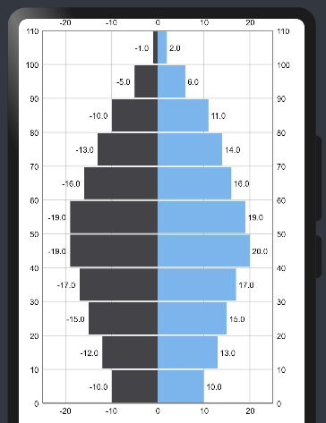
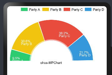
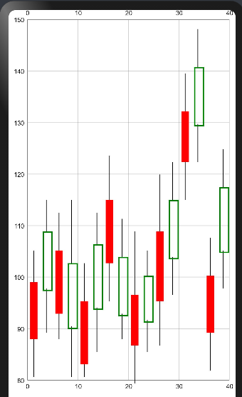
效果展示
組件功能描述
Ohos-MPChart是一個強大的圖表視圖,主要提供多種多樣的圖表視圖,包括折線圖、曲線圖、柱形圖、餅狀圖、K線圖等等,具體功能模塊如下:

開發環境
安裝IDE:支持DevEco Studio 3.0 Release(Build Version 3.0.0.993)版本。 安裝SDK:支持OpenHarmony API version 8 及以上版本
使用方法
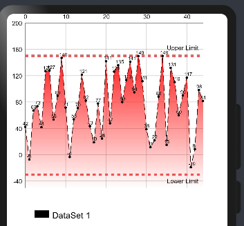
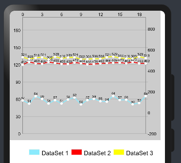
圖表一:折線圖
1.下載Ohos-MPChart組件并導入LineChart自定義組件:
//下載mpchart組件 npm install @ohos/mpchart --saveimport{LineChart}from'@ohos/ohos_mpchart'
OpenHarmony npm環境配置等更多內容,請參考安裝教程
如何安裝OpenHarmony npm包
https://gitee.com/openharmony-tpc/docs/blob/master/OpenHarmony_npm_usage.md
2.初始化數據
aboutToAppear() {    this.lineData = this.initCurveData(45, 100);    this.topAxis.setLabelCount(5, false);    this.topAxis.setPosition(XAxisPosition.TOP);    this.topAxis.setAxisMinimum(0);    this.topAxis.setAxisMaximum(50);    this.bottomAxis.setLabelCount(5, false);this.bottomAxis.setPosition(XAxisPosition.BOTTOM);    this.bottomAxis.setAxisMinimum(0);    this.bottomAxis.setAxisMaximum(50);    this.bottomAxis.setDrawAxisLine(false);    this.bottomAxis.setDrawLabels(false)
    this.leftAxis = new YAxis(AxisDependency.LEFT);    this.leftAxis.setLabelCount(7, false);    this.leftAxis.setPosition(YAxisLabelPosition.OUTSIDE_CHART);    this.leftAxis.setSpaceTop(15);    this.leftAxis.setAxisMinimum(-50);    this.leftAxis.setAxisMaximum(200);    this.leftAxis.enableGridDashedLine(5,5,0)
    this.rightAxis = new YAxis(AxisDependency.RIGHT);    this.rightAxis.setDrawGridLines(false);    this.rightAxis.setLabelCount(7, false);    this.rightAxis.setSpaceTop(11);    this.rightAxis.setAxisMinimum(-50); // this replaces setStartAtZero(true)    this.rightAxis.setAxisMaximum(200);    this.rightAxis.setDrawAxisLine(false);
    var upperLimtLine:LimitLine= new LimitLine(150, "Upper Limit");    upperLimtLine.setLineWidth(4);    upperLimtLine.enableDashedLine(10, 10, 0);    upperLimtLine.setLabelPosition(LimitLabelPosition.RIGHT_TOP);    upperLimtLine.setTextSize(10);
    var lowerLimtLine:LimitLine= new LimitLine(-30, "Lower Limit");    lowerLimtLine.setLineWidth(4);    lowerLimtLine.enableDashedLine(5, 5, 0);    lowerLimtLine.setLabelPosition(LimitLabelPosition.RIGHT_BOTTOM);    lowerLimtLine.setTextSize(10);
    this.leftAxis.setDrawLimitLinesBehindData(true);    this.leftAxis.addLimitLine(upperLimtLine);    this.leftAxis.addLimitLine(lowerLimtLine);  }  private initCurveData(count: number, range: number): LineData {
    let values = new JArrayList();
    for (let i = 0; i < 50; i++) {      let val: number = Math.random() * 180 - 30;      values.add(new EntryOhos(i, val));    }
    let gradientFillColor = new Array();    gradientFillColor.push(['#ffff0000', 0.1])    gradientFillColor.push(['#00ff0000', 1.0])
    let dataSet = new JArrayList();
    let set1 = new LineDataSet(values, "DataSet 1");    set1.setDrawFilled(true);    set1.enableDashedLine(10,5,0)    set1.setMode(Mode.LINEAR);    set1.setGradientFillColor(gradientFillColor)    set1.setColorByColor(Color.Black);    set1.setLineWidth(1)    set1.setDrawCircles(true);    set1.setCircleColor(Color.Black);    set1.setCircleRadius(2);    set1.setCircleHoleRadius(1)    set1.setCircleHoleColor(Color.Green)    set1.setDrawCircleHole(false)    dataSet.add(set1);
    return new LineData(dataSet)}
3.添加數據到自定義曲線圖表組件
build() { Stack({ alignContent: Alignment.TopStart }) { LineChart({ topAxis: this.topAxis, bottomAxis: this.bottomAxis, width: this.width, height: this.height, minOffset: this.minOffset, leftAxis: this.leftAxis, rightAxis: this.rightAxis, lineData: this.lineData, }) }}
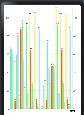
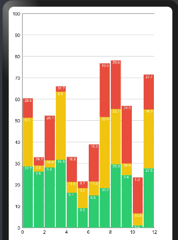
圖表二:柱狀圖
1.導入BarChart自定義組件:
import{BarChart,BarChartModel} from '@ohos/ohos_mpchart'
2.初始化數據
@State model:BarChartModel = new BarChartModel();  width: number = 350; //表的寬度  height: number = 500; //表的高度  minOffset: number = 15; //X軸線偏移量  leftAxis: YAxis = null;  rightAxis: YAxis = null;  bottomAxis: XAxis = new XAxis();
  private aboutToAppear(){    this.leftAxis = new YAxis(AxisDependency.LEFT);    this.leftAxis.setLabelCount(6, false);    this.leftAxis.setPosition(YAxisLabelPosition.OUTSIDE_CHART);    this.leftAxis.setSpaceTop(15);    this.leftAxis.setAxisMinimum(0);    this.leftAxis.setAxisMaximum(110);    this.leftAxis.enableGridDashedLine(10,10,0)
    this.rightAxis = new YAxis(AxisDependency.RIGHT);    this.rightAxis.setDrawGridLines(false);    this.rightAxis.setLabelCount(6, false);    this.rightAxis.setSpaceTop(11);    this.rightAxis.setAxisMinimum(0);    this.rightAxis.setAxisMaximum(110);
    this.bottomAxis.setLabelCount(5, false);    this.bottomAxis.setPosition(XAxisPosition.BOTTOM);    this.bottomAxis.setAxisMinimum(0);    this.bottomAxis.setAxisMaximum(10);
    this.setData(this.bottomAxis.getAxisMaximum(),this.leftAxis.getAxisMaximum())
    this.model.width = this.width;    this.model.height = this.height;    this.model.init();    this.model.setDrawBarShadow(false);    this.model.setDrawValueAboveBar(true);    this.model.getDescription().setEnabled(false);    this.model.setMaxVisibleValueCount(60);    this.model.setLeftYAxis(this.leftAxis);    this.model.setRightYAxis(this.rightAxis);    this.model.setXAxis(this.bottomAxis)    this.model.mRenderer.initBuffers();    this.model.prepareMatrixValuePx();  }  private setData(count: number, range: number) {    let groupSpace: number = 0.08;    let barSpace: number = 0.03; // x4 DataSet    let barWidth: number = 0.2; // x4 DataSet    let groupCount: number = count + 1;    let startYear: number = 1980;    let endYear: number = startYear + groupCount;    let values1:JArrayList =     new JArrayList();    let values2:JArrayList =     new JArrayList();    let values3:JArrayList =     new JArrayList();    let values4:JArrayList =     new JArrayList();    let randomMultiplier: number = range;    for (let i = startYear; i < endYear; i++) {      values1.add(new BarEntry(i,       (Math.random() * randomMultiplier)))      values2.add(new BarEntry(i,       (Math.random() * randomMultiplier)))      values3.add(new BarEntry(i,       (Math.random() * randomMultiplier)))      values4.add(new BarEntry(i,       (Math.random() * randomMultiplier)))    }    let set1: BarDataSet,set2:     BarDataSet,set3: BarDataSet,set4: BarDataSet;    if (this.model.getBarData() != null &&    this.model.getBarData().getDataSetCount() > 0) {      set1 = this.model.getBarData().getDataSetByIndex(0) as BarDataSet;      set2 = this.model.getBarData().getDataSetByIndex(1) as BarDataSet;      set3 = this.model.getBarData().getDataSetByIndex(2) as BarDataSet;      set4 = this.model.getBarData().getDataSetByIndex(3) as BarDataSet;      set1.setValues(values1);      set2.setValues(values2);      set3.setValues(values3);      set4.setValues(values4);      this.model.getBarData().notifyDataChanged();      this.model.notifyDataSetChanged();
    } else {      let colors: number[] =       [Color.rgb(104, 241, 175),Color.rgb(164, 228, 251),Color.rgb(242, 247, 158),Color.rgb(255, 102, 0)];      set1 = new BarDataSet(values1, "Company A");      set1.setColorsByArr(colors);      set2 = new BarDataSet(values2, "Company B");      set2.setColorsByArr(colors);      set3 = new BarDataSet(values3, "Company C");      set3.setColorsByArr(colors);      set4 = new BarDataSet(values2, "Company D");      set4.setColorsByArr(colors);
      let dataSets: JArrayList =       new JArrayList();      dataSets.add(set1);      dataSets.add(set2);      dataSets.add(set3);      dataSets.add(set4);
      let data: BarData = new BarData(dataSets);      this.model.setData(data);    }    this.model.getBarData().setBarWidth(barWidth);    this.bottomAxis.setAxisMinimum(startYear);    this.bottomAxis.setAxisMaximum(startYear + this.model.getBarData().getGroupWidth(groupSpace, barSpace) * groupCount);    this.model.groupBars(startYear, groupSpace, barSpace);}
3.添加數據到自定義曲線圖表組件
build() { Stack(){ BarChart({model:this.model}) }}
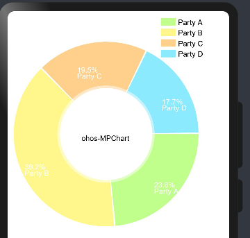
圖表三:餅狀圖
1.導入PieChart自定義組件:
import { PieChart } from '@ohos/ohos_mpchart'
2.初始化數據
pieData: PieData = null;  @State pieModel: PieChart.Model = new PieChart.Model()  @State @Watch("seekBarXValueWatch")   seekBarX: SeekBar.Model = new SeekBar.Model()  @State @Watch("seekBarYValueWatch")   seekBarY: SeekBar.Model = new SeekBar.Model()  parties: string[] = [    "Party A", "Party B", "Party C", "Party D", "Party E", "Party F", "Party G", "Party H",    "Party I", "Party J", "Party K", "Party L", "Party M", "Party N", "Party O", "Party P",    "Party Q", "Party R", "Party S", "Party T", "Party U", "Party V", "Party W", "Party X",    "Party Y", "Party Z"]
  private aboutToAppear(): void {    this.pieData = this.initPieData(4, 10);    this.pieModel      .setPieData(this.pieData)      .setRadius(150)      .setHoleRadius(0.5)      .setOffset(new MPPointF(160,200))   // vp  }  private initPieData(count: number,   range: number): PieData{    let entries = new JArrayList();    for (var i = 0; i < count; i++) {      entries.add(new PieEntry(((Math.random() * range) + range / 5), this.parties[i % this.parties.length]))    }    //        entries.add(new PieEntry(4,'Party A'))    //        entries.add(new PieEntry(2,'Party B'))    //        entries.add(new PieEntry(5,'Party C'))    //        entries.add(new PieEntry(3,'Party D'))
    let dataSet: PieDataSet = new PieDataSet(entries,     "Election Results");    dataSet.setDrawIcons(false);    dataSet.setSliceSpace(3);    dataSet.setIconsOffset(new MPPointF(0, 40));    dataSet.setSelectionShift(5);
    // add a lot of colors    let colors: JArrayList = new JArrayList();    for (let index = 0;     index < ColorTemplate.VORDIPLOM_COLORS.length; index++) {      colors.add(ColorTemplate.VORDIPLOM_COLORS[index]);    }
    for (let index = 0;     index < ColorTemplate.JOYFUL_COLORS.length; index++) {      colors.add(ColorTemplate.JOYFUL_COLORS[index]);    }
    for (let index = 0;     index < ColorTemplate.COLORFUL_COLORS.length; index++) {      colors.add(ColorTemplate.COLORFUL_COLORS[index]);    }    for (let index = 0;     index < ColorTemplate.LIBERTY_COLORS.length; index++) {      colors.add(ColorTemplate.LIBERTY_COLORS[index]);    }    for (let index = 0;     index < ColorTemplate.PASTEL_COLORS.length; index++) {      colors.add(ColorTemplate.PASTEL_COLORS[index]);    }    colors.add(ColorTemplate.getHoloBlue());    dataSet.setColorsByList(colors);    return new PieData(dataSet)??}
3.添加數據到自定義曲線圖表組件
build() { Column() { PieChart({ model: this.pieModel }) }
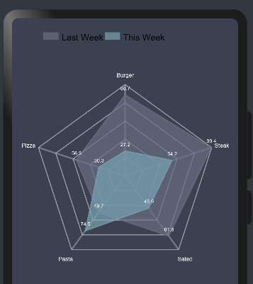
圖表四:雷達圖
1.導入RadarChart自定義組件:
import{RadarChart}from'@ohos/ohos_mpchart';
2.初始化數據
width: number = 300; //表的寬度 height: number = 300 //表的高度 minOffset: number = 5; //X軸線偏移量 xAxis: XAxis = new XAxis(); //頂部X軸 yAxis: YAxis = new YAxis(); data:RadarData= new RadarData(); @State radarChartMode:RadarChartMode=new RadarChartMode();public aboutToAppear() { this.model.menuItemArr = this.menuItemArr this.model.title = this.title this.data=this.initRadarData( 5,50) this.xAxis.setTextSize(9); this.xAxis.setYOffset(0); this.xAxis.setXOffset(0); this.xAxis.setTextColor(Color.White); const mActivities:string[] = ["Burger", "Steak", "Salad", "Pasta", "Pizza"]; this.xAxis.setValueFormatter(new class RadarAxisValueFormatter implements IAxisValueFormatter{ public getFormattedValue( value:number, axisstring { return mActivities[value % mActivities.length]; } }); this.xAxis.longest=mActivities[0]; this.yAxis.setLabelCount(5, false); this.yAxis.setTextSize(9); this.yAxis.setAxisMinimum(0); this.yAxis.setAxisMaximum(80); this.yAxis.setDrawLabels(false); this.radarChartMode.mRotateEnabled=false this.radarChartMode.setYExtraOffset(this.model.height) this.radarChartMode.setXAxis(this.xAxis) this.radarChartMode.setYAxis(this.yAxis) this.radarChartMode.setWidth(this.width) this.radarChartMode.setHeight(this.height) this.radarChartMode.setMinOffset(this.minOffset) this.radarChartMode.setData(this.data) this.radarChartMode.setPaddingLeft(30) this.radarChartMode.setPaddingTop(100) this.radarChartMode.init(); //this.animate('Animate XY') } private initRadarData(count: number, range: number): RadarData { let mul:number = 80; let min:number = 20; let cnt:number = 5; let entries1 = new JArrayList(); let entries2 = new JArrayList (); // NOTE: The order of the entries when being added to the entries array determines their position around the center of // the chart. for (let i = 0; i < cnt; i++) { let val1:number = Math.random() * mul + min; entries1.add(new RadarEntry(val1)); let val2:number = Math.random() * mul + min; entries2.add(new RadarEntry(val2)); } let set1:RadarDataSet = new RadarDataSet(entries1, "Last Week"); set1.setColorByColor(0xb4676e81); set1.setFillColor(0xb4676e81); set1.setDrawFilled(true); set1.setFillAlpha(180); set1.setLineWidth(2); set1.setDrawHighlightCircleEnabled(true); set1.setDrawHighlightIndicators(false); set1.setHighlightCircleStrokeColor(0xffffffff); set1.setHighlightCircleFillColor(0xb4676e81) set1.setDrawValues(true) set1.setIconsOffset(new MPPointF(0, px2vp(0))); let set2:RadarDataSet = new RadarDataSet(entries2, "This Week"); set2.setColorByColor(0xb479a2af); set2.setFillColor(0xb479a2af); set2.setDrawFilled(true); set2.setFillAlpha(180); set2.setLineWidth(2); set2.setDrawHighlightCircleEnabled(true); set2.setDrawHighlightIndicators(false); set2.setHighlightCircleStrokeColor(0xffffffff); set2.setHighlightCircleFillColor(0xb479a2af) set2.setDrawValues(true) set2.setIconsOffset(new MPPointF(0, px2vp(0))); let sets = new JArrayList (); sets.add(set1); sets.add(set2); // let data:RadarData = new RadarData(sets); data.setValueTextSize(8); data.setDrawValues(this.isDrawValuesEnable); data.setValueTextColor(Color.White); return data } public getFormattedValue(value: number): string { var str = String(value.toFixed(1)).split("."); if(str[1] == "0"){ return str[0]; }else{ return String(value.toFixed(1)) }}
3.添加數據到自定義曲線圖表組件
build() { Column() { Stack({ alignContent: Alignment.TopStart }) { RadarChart({ radarChartMode:this.radarChartMode, }) } }}
其他圖表使用方式與以上圖表使用方法基本一致
-
接口
+關注
關注
33文章
8691瀏覽量
151909 -
數據
+關注
關注
8文章
7139瀏覽量
89565 -
OpenHarmony
+關注
關注
25文章
3744瀏覽量
16574
原文標題:Ohos-MPChart——支持多種圖表繪制的組件
文章出處:【微信號:gh_e4f28cfa3159,微信公眾號:OpenAtom OpenHarmony】歡迎添加關注!文章轉載請注明出處。
發布評論請先 登錄
相關推薦
Ohos-MPChart組件功能描述
各種各樣的電容該怎么選擇?
Proteus實例集錦,包括電路圖、仿真程序,各種各樣的電路
這些線路中傳輸著各種各樣的控制信號
現代世界中充滿了各種各樣的電子傳感器
Ohos-MPChart——支持多種圖表繪制的組件
Ohos-MPChart——支持多種圖表繪制的組件
Proteus實例集錦(包括電路圖.仿真程序,各種各樣的電路


 工商網監
工商網監
評論