") 鴻蒙OS開(kāi)發(fā):【一次開(kāi)發(fā),多端部署】(響應(yīng)式布局)
鴻蒙OS開(kāi)發(fā):【一次開(kāi)發(fā),多端部署】(響應(yīng)式布局)
響應(yīng)式布局
自適應(yīng)布局可以保證窗口尺寸在一定范圍內(nèi)變化時(shí),頁(yè)面的顯示是正常的。但是將窗口尺寸變化較大時(shí)(如窗口寬度從400vp變化為1000vp),僅僅依靠自適應(yīng)布局可能出現(xiàn)圖片異常放大或頁(yè)面內(nèi)容稀疏、留白過(guò)多等問(wèn)題,此時(shí)就需要借助響應(yīng)式布局能力調(diào)整頁(yè)面結(jié)構(gòu)。
響應(yīng)式布局是指頁(yè)面內(nèi)的元素可以根據(jù)特定的特征(如窗口寬度、屏幕方向等)自動(dòng)變化以適應(yīng)外部容器變化的布局能力。響應(yīng)式布局中最常使用的特征是窗口寬度,可以將窗口寬度劃分為不同的范圍(下文中稱(chēng)為斷點(diǎn))。當(dāng)窗口寬度從一個(gè)斷點(diǎn)變化到另一個(gè)斷點(diǎn)時(shí),改變頁(yè)面布局(如將頁(yè)面內(nèi)容從單列排布調(diào)整為雙列排布甚至三列排布等)以獲得更好的顯示效果。
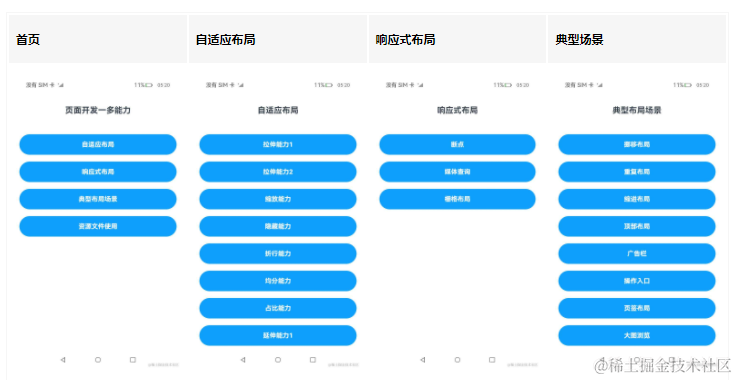
當(dāng)前系統(tǒng)提供了如下三種響應(yīng)式布局能力,后文中我們將依次展開(kāi)介紹。
| 響應(yīng)式布局能力 | 簡(jiǎn)介 |
|---|---|
| [斷點(diǎn)] | 將窗口寬度劃分為不同的范圍(即斷點(diǎn)),監(jiān)聽(tīng)窗口尺寸變化,當(dāng)斷點(diǎn)改變時(shí)同步調(diào)整頁(yè)面布局。 |
| [媒體查詢] | 媒體查詢支持監(jiān)聽(tīng)窗口寬度、橫豎屏、深淺色、設(shè)備類(lèi)型等多種媒體特征,當(dāng)媒體特征發(fā)生改變時(shí)同步調(diào)整頁(yè)面布局。 |
| [柵格布局] | 柵格組件將其所在的區(qū)域劃分為有規(guī)律的多列,通過(guò)調(diào)整不同斷點(diǎn)下的柵格組件的參數(shù)以及其子組件占據(jù)的列數(shù)等,實(shí)現(xiàn)不同的布局效果。 |
斷點(diǎn)
斷點(diǎn)以應(yīng)用窗口寬度為切入點(diǎn),將應(yīng)用窗口在寬度維度上分成了幾個(gè)不同的區(qū)間即不同的斷點(diǎn),在不同的區(qū)間下,開(kāi)發(fā)者可根據(jù)需要實(shí)現(xiàn)不同的頁(yè)面布局效果。具體的斷點(diǎn)如下所示。
| 斷點(diǎn)名稱(chēng) | 取值范圍(vp) |
|---|---|
| xs | [0, 320) |
| sm | [320, 600) |
| md | [600, 840) |
| lg | [840, +∞) |
說(shuō)明:開(kāi)發(fā)前請(qǐng)熟悉鴻蒙開(kāi)發(fā)指導(dǎo)文檔 :[
gitee.com/li-shizhen-skin/harmony-os/blob/master/README.md]
- 以設(shè)備屏幕寬度作為參照物,也可以實(shí)現(xiàn)類(lèi)似的效果。考慮到應(yīng)用可能以非全屏窗口的形式顯示,以應(yīng)用窗口寬度為參照物更為通用。
- 開(kāi)發(fā)者可以根據(jù)實(shí)際使用場(chǎng)景決定適配哪些斷點(diǎn)。如xs斷點(diǎn)對(duì)應(yīng)的一般是智能穿戴類(lèi)設(shè)備,如果確定某頁(yè)面不會(huì)在智能穿戴設(shè)備上顯示,則可以不適配xs斷點(diǎn)。
- 可以根據(jù)實(shí)際需要在lg斷點(diǎn)后面新增xl、xxl等斷點(diǎn),但注意新增斷點(diǎn)會(huì)同時(shí)增加UX設(shè)計(jì)師及應(yīng)用開(kāi)發(fā)者的工作量,除非必要否則不建議盲目新增斷點(diǎn)。
系統(tǒng)提供了多種方法,判斷應(yīng)用當(dāng)前處于何種斷點(diǎn),進(jìn)而可以調(diào)整應(yīng)用的布局。常見(jiàn)的監(jiān)聽(tīng)斷點(diǎn)變化的方法如下所示:
- 獲取窗口對(duì)象并監(jiān)聽(tīng)窗口尺寸變化
- 通過(guò)媒體查詢監(jiān)聽(tīng)?wèi)?yīng)用窗口尺寸變化
- 借助柵格組件能力監(jiān)聽(tīng)不同斷點(diǎn)的變化
本小節(jié)中,先介紹如何通過(guò)窗口對(duì)象監(jiān)聽(tīng)斷點(diǎn)變化,后續(xù)的媒體查詢及柵格章節(jié)中,將進(jìn)一步展開(kāi)介紹另外兩種方法。
通過(guò)窗口對(duì)象監(jiān)聽(tīng)斷點(diǎn)變化的核心是獲取窗口對(duì)象及注冊(cè)窗口尺寸變化的回調(diào)函數(shù)。
- 在UIAbility的[onWindowStageCreate]生命周期回調(diào)中,通過(guò)[窗口]對(duì)象獲取啟動(dòng)時(shí)的應(yīng)用窗口寬度并注冊(cè)回調(diào)函數(shù)監(jiān)聽(tīng)窗口尺寸變化。將窗口尺寸的長(zhǎng)度單位[由px換算為vp]后,即可基于前文中介紹的規(guī)則得到當(dāng)前斷點(diǎn)值,此時(shí)可以使用[狀態(tài)變量]記錄當(dāng)前的斷點(diǎn)值方便后續(xù)使用。
// MainAbility.ts import window from '@ohos.window' import display from '@ohos.display' import UIAbility from '@ohos.app.ability.UIAbility' export default class MainAbility extends UIAbility { private windowObj?: window.Window private curBp: string = '' //... // 根據(jù)當(dāng)前窗口尺寸更新斷點(diǎn) private updateBreakpoint(windowWidth: number) :void{ // 將長(zhǎng)度的單位由px換算為vp let windowWidthVp = windowWidth / display.getDefaultDisplaySync().densityPixels let newBp: string = '' if (windowWidthVp < 320) { newBp = 'xs' } else if (windowWidthVp < 600) { newBp = 'sm' } else if (windowWidthVp < 840) { newBp = 'md' } else { newBp = 'lg' } if (this.curBp !== newBp) { this.curBp = newBp // 使用狀態(tài)變量記錄當(dāng)前斷點(diǎn)值 AppStorage.setOrCreate('currentBreakpoint', this.curBp) } } onWindowStageCreate(windowStage: window.WindowStage) :void{ windowStage.getMainWindow().then((windowObj) = > { this.windowObj = windowObj // 獲取應(yīng)用啟動(dòng)時(shí)的窗口尺寸 this.updateBreakpoint(windowObj.getWindowProperties().windowRect.width) // 注冊(cè)回調(diào)函數(shù),監(jiān)聽(tīng)窗口尺寸變化 windowObj.on('windowSizeChange', (windowSize)= >{ this.updateBreakpoint(windowSize.width) }) }); // ... } //... } - 在頁(yè)面中,獲取及使用當(dāng)前的斷點(diǎn)。
@Entry @Component struct Index { @StorageProp('currentBreakpoint') curBp: string = 'sm' build() { Flex({justifyContent: FlexAlign.Center, alignItems: ItemAlign.Center}) { Text(this.curBp).fontSize(50).fontWeight(FontWeight.Medium) } .width('100%') .height('100%') } } - 運(yùn)行及驗(yàn)證效果。
媒體查詢
在實(shí)際應(yīng)用開(kāi)發(fā)過(guò)程中,開(kāi)發(fā)者常常需要針對(duì)不同類(lèi)型設(shè)備或同一類(lèi)型設(shè)備的不同狀態(tài)來(lái)修改應(yīng)用的樣式。媒體查詢提供了豐富的媒體特征監(jiān)聽(tīng)能力,可以監(jiān)聽(tīng)?wèi)?yīng)用顯示區(qū)域變化、橫豎屏、深淺色、設(shè)備類(lèi)型等等,因此在應(yīng)用開(kāi)發(fā)過(guò)程中使用的非常廣泛。
本小節(jié)僅介紹 媒體查詢跟斷點(diǎn)的結(jié)合 ,即如何借助媒體查詢能力,監(jiān)聽(tīng)[斷點(diǎn)]的變化,讀者可以自行查閱官網(wǎng)中關(guān)于[媒體查詢]的相關(guān)介紹了解更詳細(xì)的用法。
說(shuō)明: 類(lèi)Web開(kāi)發(fā)范式,支持在js文件和css文件中使用媒體查詢,請(qǐng)查看[js媒體查詢]和[css媒體查詢]了解詳細(xì)用法。
示例:
通過(guò)媒體查詢,監(jiān)聽(tīng)?wèi)?yīng)用窗口寬度變化,獲取當(dāng)前應(yīng)用所處的斷點(diǎn)值。

1.對(duì)通過(guò)媒體查詢監(jiān)聽(tīng)[斷點(diǎn)]的功能做簡(jiǎn)單的封裝,方便后續(xù)使用
// common/breakpointsystem.ets
import mediaQuery from '@ohos.mediaquery'

export type BreakpointType = 'xs' | 'sm' | 'md' | 'lg' | 'xl' | 'xxl'

export interface Breakpoint {
  name: BreakpointType
  size: number
  mediaQueryListener?: mediaQuery.MediaQueryListener
}

export class BreakpointSystem {
  private static instance: BreakpointSystem
  private readonly breakpoints: Breakpoint[] = [
    { name: 'xs', size: 0 },
    { name: 'sm', size: 320 },
    { name: 'md', size: 600 },
    { name: 'lg', size: 840 }
  ]
  private states: Set
2.在頁(yè)面中,通過(guò)媒體查詢,監(jiān)聽(tīng)?wèi)?yīng)用窗口寬度變化,獲取當(dāng)前應(yīng)用所處的斷點(diǎn)值
// MediaQuerySample.ets
import { BreakpointSystem, BreakpointState } from '../common/breakpointsystem'
@Entry
@Component
struct MediaQuerySample {
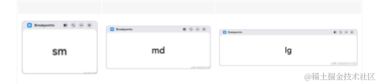
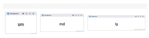
@State compStr: BreakpointState< string > = BreakpointState.of({ sm: "sm", md: "md", lg: "lg" })
@State compImg: BreakpointState< Resource > = BreakpointState.of({
sm: $r('app.media.sm'),
md: $r('app.media.md'),
lg: $r('app.media.lg')
});
aboutToAppear() {
BreakpointSystem.getInstance().attach(this.compStr)
BreakpointSystem.getInstance().attach(this.compImg)
BreakpointSystem.getInstance().start()
}
aboutToDisappear() {
BreakpointSystem.getInstance().detach(this.compStr)
BreakpointSystem.getInstance().detach(this.compImg)
BreakpointSystem.getInstance().stop()
}
build() {
Flex({ direction: FlexDirection.Column, alignItems: ItemAlign.Center, justifyContent: FlexAlign.Center }) {
Column()
.height(100)
.width(100)
.backgroundImage(this.compImg.value)
.backgroundImagePosition(Alignment.Center)
.backgroundImageSize(ImageSize.Contain)
Text(this.compStr.value)
.fontSize(24)
.margin(10)
}
.width('100%')
.height('100%')
}
}
柵格布局
簡(jiǎn)介
柵格是多設(shè)備場(chǎng)景下通用的輔助定位工具,通過(guò)將空間分割為有規(guī)律的柵格。柵格可以顯著降低適配不同屏幕尺寸的設(shè)計(jì)及開(kāi)發(fā)成本,使得整體設(shè)計(jì)和開(kāi)發(fā)流程更有秩序和節(jié)奏感,同時(shí)也保證多設(shè)備上應(yīng)用顯示的協(xié)調(diào)性和一致性,提升用戶體驗(yàn)。

柵格的樣式由Margin、Gutter、Columns三個(gè)屬性決定。
- Margin是相對(duì)應(yīng)用窗口、父容器的左右邊緣的距離,決定了內(nèi)容可展示的整體寬度。
- Gutter是相鄰的兩個(gè)Column之間的距離,決定內(nèi)容間的緊密程度。
- Columns是柵格中的列數(shù),其數(shù)值決定了內(nèi)容的布局復(fù)雜度。
單個(gè)Column的寬度是系統(tǒng)結(jié)合Margin、Gutter和Columns自動(dòng)計(jì)算的,不需要也不允許開(kāi)發(fā)者手動(dòng)配置。
柵格布局就是柵格結(jié)合了斷點(diǎn),實(shí)現(xiàn)柵格布局能力的組件叫柵格組件。在實(shí)際使用場(chǎng)景中,可以根據(jù)需要配置不同斷點(diǎn)下柵格組件中元素占據(jù)的列數(shù),同時(shí)也可以調(diào)整Margin、Gutter、Columns的取值,從而實(shí)現(xiàn)不同的布局效果。

說(shuō)明:
- ArkUI在API 9對(duì)柵格組件做了重構(gòu),推出了新的柵格組件[GridRow]和[GridCol],同時(shí)原有的[GridContainer組件]及[柵格設(shè)置]已經(jīng)廢棄。
- 本文中提到的柵格組件,如無(wú)特別說(shuō)明,都是指GridRow和GridCol組件。
柵格組件的斷點(diǎn)
柵格組件提供了豐富的斷點(diǎn)定制能力。
(一)開(kāi)發(fā)者可以修改斷點(diǎn)的取值范圍,支持啟用最多6個(gè)斷點(diǎn)。
- 基于本文斷點(diǎn)小節(jié)介紹的推薦值,柵格組件默認(rèn)提供xs、sm、md、lg四個(gè)斷點(diǎn)。
- 柵格組件支持開(kāi)發(fā)者修改斷點(diǎn)的取值范圍,除了默認(rèn)的四個(gè)斷點(diǎn),還支持開(kāi)發(fā)者啟用xl和xxl兩個(gè)額外的斷點(diǎn)。
說(shuō)明: 斷點(diǎn)并非越多越好,通常每個(gè)斷點(diǎn)都需要開(kāi)發(fā)者“精心適配”以達(dá)到最佳顯示效果。
示例1:
修改默認(rèn)的斷點(diǎn)范圍,同時(shí)啟用xl和xxl斷點(diǎn)。
圖片右下角顯示了當(dāng)前設(shè)備屏幕的尺寸(即應(yīng)用窗口尺寸),可以看到隨著窗口尺寸發(fā)生變化,柵格的斷點(diǎn)也相應(yīng)發(fā)生了改變。(為了便于理解,下圖中將設(shè)備的DPI設(shè)置為160,此時(shí)1vp=1px)

@Entry
@Component
struct GridRowSample1 {
  @State private currentBreakpoint: string = 'unknown'
  build() {
    // 修改斷點(diǎn)的取值范圍同時(shí)啟用更多斷點(diǎn),注意,修改的斷點(diǎn)值后面必須加上vp單位。
    GridRow({breakpoints: {value: ['600vp', '700vp', '800vp', '900vp', '1000vp'],
      reference: BreakpointsReference.WindowSize}}) {
      GridCol({span:{xs: 12, sm: 12, md: 12, lg:12, xl: 12, xxl:12}}) {
        Flex({ direction: FlexDirection.Column, alignItems: ItemAlign.Center, justifyContent: FlexAlign.Center }) {
          Text(this.currentBreakpoint).fontSize(50).fontWeight(FontWeight.Medium)
        }
      }
    }.onBreakpointChange((currentBreakpoint: string) = > {
      this.currentBreakpoint = currentBreakpoint
    })
  }
}
(二)柵格斷點(diǎn)默認(rèn)以窗口寬度為參照物,同時(shí)還允許開(kāi)發(fā)者配置為以柵格組件本身的寬度為參照物。
柵格既可以用于頁(yè)面整體布局的場(chǎng)景,也可以用于頁(yè)面局部布局的場(chǎng)景。考慮到在實(shí)際場(chǎng)景中,存在應(yīng)用窗口尺寸不變但是局部區(qū)域尺寸發(fā)生了變化的情況,柵格組件支持以自身寬度為參照物響應(yīng)斷點(diǎn)變化具有更大的靈活性。
示例2:
以柵格組件寬度為參考物響應(yīng)斷點(diǎn)變化。滿足窗口尺寸不變,而部分內(nèi)容區(qū)需要做響應(yīng)式變化的場(chǎng)景。
為了便于理解,下圖中自定義預(yù)覽器的設(shè)備屏幕寬度設(shè)置為650vp。示例代碼中將側(cè)邊欄的變化范圍控制在[100vp, 600vp],那么右側(cè)的柵格組件寬度相對(duì)應(yīng)在[550vp, 50vp]之間變化。根據(jù)代碼中對(duì)柵格斷點(diǎn)的配置,柵格組件寬度發(fā)生變化時(shí),其斷點(diǎn)相應(yīng)的發(fā)生改變。

@Entry
@Component
struct GridRowSample2 {
  @State private currentBreakpoint: string = 'unknown';
  build() {
    // 用戶可以通過(guò)拖拽側(cè)邊欄組件中的分隔線,調(diào)整側(cè)邊欄和內(nèi)容區(qū)的寬度。
    SideBarContainer(SideBarContainerType.Embed)
    {
      // 側(cè)邊欄,尺寸變化范圍 [100vp, 600vp]
      Column(){}.width('100%').backgroundColor('#19000000')

      // 內(nèi)容區(qū),尺寸變化范圍 [550vp, 50vp]
      GridRow({breakpoints: {value: ['100vp', '200vp', '300vp', '400vp', '500vp'],
        reference: BreakpointsReference.ComponentSize}}) {
        GridCol({span:{xs: 12, sm: 12, md: 12, lg:12, xl: 12, xxl:12}}) {
          Flex({ direction: FlexDirection.Column, alignItems: ItemAlign.Center, justifyContent: FlexAlign.Center }) {
            Text(this.currentBreakpoint).fontSize(50).fontWeight(FontWeight.Medium)
          }
        }
      }.onBreakpointChange((currentBreakpoint: string) = > {
        this.currentBreakpoint = currentBreakpoint;
      }).width('100%')
    }
    // 側(cè)邊欄拖拽到最小寬度時(shí),不自動(dòng)隱藏
    .autoHide(false)
    .sideBarWidth(100)
    // 側(cè)邊欄的最小寬度
    .minSideBarWidth(100)
    // 側(cè)邊欄的最大寬度
    .maxSideBarWidth(600)
  }
}
(三)柵格組件的斷點(diǎn)發(fā)生變化時(shí),會(huì)通過(guò)onBreakPointChange事件通知開(kāi)發(fā)者。
在之前的兩個(gè)例子中,已經(jīng)演示了onBreakpointChange事件的用法,此處不再贅述。
柵格組件的columns、gutter和margin
柵格組件columns默認(rèn)為12列,gutter默認(rèn)為0,同時(shí)支持開(kāi)發(fā)者根據(jù)實(shí)際需要定義不同斷點(diǎn)下的columns數(shù)量以及gutter長(zhǎng)度。特別的,在柵格組件實(shí)際使用過(guò)程中,常常會(huì)發(fā)生多個(gè)元素占據(jù)的列數(shù)相加超過(guò)總列數(shù)而折行的場(chǎng)景。柵格組件還允許開(kāi)發(fā)者分別定義水平方向的gutter(相鄰兩列之間的間距)和垂直方向的gutter(折行時(shí)相鄰兩行之間的間距)。
考慮到[組件通用屬性]中已經(jīng)有margin和padding,柵格組件不再單獨(dú)提供額外的margin屬性,直接使用通用屬性即可。借助margin或者padding屬性,均可以控制柵格組件與父容器左右邊緣的距離,但是二者也存在一些差異:
- margin區(qū)域在柵格組件的邊界外,padding區(qū)域在柵格組件的邊界內(nèi)。
- 柵格組件的backgroundColor會(huì)影響padding區(qū)域,但不會(huì)影響margin區(qū)域。
總的來(lái)講,margin在組件外而padding在組件內(nèi),開(kāi)發(fā)者可以根據(jù)實(shí)際需要進(jìn)行選擇及實(shí)現(xiàn)目標(biāo)效果。
示例3:
不同斷點(diǎn)下,定義不同的columns和gutter。

@Entry
@Component
struct GridRowSample3 {
  private bgColors: ResourceColor[] = [
     $r('sys.color.ohos_id_color_palette_aux1'),
     $r('sys.color.ohos_id_color_palette_aux2'),
     $r('sys.color.ohos_id_color_palette_aux3'),
     $r('sys.color.ohos_id_color_palette_aux4'),
     $r('sys.color.ohos_id_color_palette_aux5'),
     $r('sys.color.ohos_id_color_palette_aux6')
  ]
  build() {
    // 配置不同斷點(diǎn)下columns和gutter的取值
    GridRow({columns: {sm: 4, md: 8, lg: 12},
      gutter: {x: {sm: 8, md: 16, lg: 24}, y: {sm: 8, md: 16, lg: 24}}}) {
      ForEach(this.bgColors, (bgColor:ResourceColor)= >{
        GridCol({span: {sm: 2, md: 2, lg: 2}}) {
          Row().backgroundColor(bgColor).height(30).width('100%')
        }
      })
    }
  }
}
示例4:
通過(guò)通用屬性margin或者padding,均可以控制柵格組件與其父容器左右兩側(cè)的距離,但padding區(qū)域計(jì)算在柵格組件內(nèi)而margin區(qū)域計(jì)算在柵格組件外。此外,借助onBreakpointChange事件,還可以改變不同斷點(diǎn)下margin或padding值。

@Entry
@Component
struct GridRowSample4 {
  @State private gridMargin: number = 0
  build() {
    Column() {
      Row().width('100%').height(30)

      // 使用padding控制柵格左右間距
      GridRow() {
        GridCol({span:{xs: 12, sm: 12, md: 12, lg:12}}) {
          Flex({ direction: FlexDirection.Column, alignItems: ItemAlign.Center, justifyContent: FlexAlign.Center }) {
            Text("padding").fontSize(24).fontWeight(FontWeight.Medium)
          }.backgroundColor('#19000000').width('100%')
        }
      }
      .height(50)
      .borderWidth(2)
      .borderColor('#F1CCB8')
      .padding({left: this.gridMargin, right: this.gridMargin})
      // 借助斷點(diǎn)變化事件配置不同斷點(diǎn)下柵格組件的左右間距值
      .onBreakpointChange((currentBreakpoint: string) = > {
        if (currentBreakpoint === 'lg' || currentBreakpoint === 'md') {
          this.gridMargin = 24
        } else {
          this.gridMargin = 12
        }
      })

      Row().width('100%').height(30)

      // 使用margin控制柵格左右間距
      GridRow() {
        GridCol({span:{xs: 12, sm: 12, md: 12, lg:12}}) {
          Flex({ direction: FlexDirection.Column, alignItems: ItemAlign.Center, justifyContent: FlexAlign.Center }) {
            Text("margin").fontSize(24).fontWeight(FontWeight.Medium)
          }.backgroundColor('#19000000').width('100%')
        }
      }
      .height(50)
      .borderWidth(2)
      .borderColor('#F1CCB8')
      .margin({left: this.gridMargin, right: this.gridMargin})
    }
  }
}
柵格組件的span、offset和order
柵格組件(GridRow)的直接孩子節(jié)點(diǎn)只可以是柵格子組件(GridCol),GridCol組件支持配置span、offset和order三個(gè)參數(shù)。這三個(gè)參數(shù)的取值按照"xs -> sm -> md -> lg -> xl -> xxl"的向后方向具有繼承性(不支持向前方向的繼承性),例如將sm斷點(diǎn)下span的值配置為3,不配置md斷點(diǎn)下span的值,則md斷點(diǎn)下span的取值也是3。
| 參數(shù)名 | 類(lèi)型 | 必填 | 默認(rèn)值 | 說(shuō)明 |
|---|---|---|---|---|
| span | {xs?: number, sm?: number, md?: number, lg?: number, xl?: number, xxl?:number} | 是 | - | 在柵格中占據(jù)的列數(shù)。span為0,意味著該元素既不參與布局計(jì)算,也不會(huì)被渲染。 |
| offset | {xs?: number, sm?: number, md?: number, lg?: number, xl?: number, xxl?:number} | 否 | 0 | 相對(duì)于前一個(gè)柵格子組件偏移的列數(shù)。 |
| order | {xs?: number, sm?: number, md?: number, lg?: number, xl?: number, xxl?:number} | 否 | 0 | 元素的序號(hào),根據(jù)柵格子組件的序號(hào),從小到大對(duì)柵格子組件做排序。 |
示例5:
通過(guò)span參數(shù)配置GridCol在不同斷點(diǎn)下占據(jù)不同的列數(shù)。特別的,將md斷點(diǎn)下和6的span配置為0,這樣在md斷點(diǎn)下3和6不會(huì)渲染和顯示。

class Obj {
  public index: number = 1;
  public color: Resource = $r('sys.color.ohos_id_color_palette_aux1')
}
@Entry
@Component
struct GridRowSample5 {
  private elements: Obj[] = [
    {index: 1, color: $r('sys.color.ohos_id_color_palette_aux1')},
    {index: 2, color: $r('sys.color.ohos_id_color_palette_aux2')},
    {index: 3, color: $r('sys.color.ohos_id_color_palette_aux3')},
    {index: 4, color: $r('sys.color.ohos_id_color_palette_aux4')},
    {index: 5, color: $r('sys.color.ohos_id_color_palette_aux5')},
    {index: 6, color: $r('sys.color.ohos_id_color_palette_aux6')},
  ]

  build() {
    GridRow() {
      ForEach(this.elements, (item:Obj)= >{
        GridCol({span: {sm: 6, md: (item.index % 3 === 0) ? 0 : 4, lg: 3}}) {
          Row() {
            Text('' + item.index).fontSize(24)
          }
          .justifyContent(FlexAlign.Center)
          .backgroundColor(item.color).height(30).width('100%')
        }
      })
    }
  }
}
示例6:
通過(guò)offset參數(shù),配置GridCol相對(duì)其前一個(gè)兄弟間隔的列數(shù)。

class Obj {
  public index: number = 1;
  public color: Resource = $r('sys.color.ohos_id_color_palette_aux1')
}
@Entry
@Component
struct GridRowSample6 {
  private elements: Obj[] = [
    {index: 1, color: $r('sys.color.ohos_id_color_palette_aux1')},
    {index: 2, color: $r('sys.color.ohos_id_color_palette_aux2')},
    {index: 3, color: $r('sys.color.ohos_id_color_palette_aux3')},
    {index: 4, color: $r('sys.color.ohos_id_color_palette_aux4')},
    {index: 5, color: $r('sys.color.ohos_id_color_palette_aux5')},
    {index: 6, color: $r('sys.color.ohos_id_color_palette_aux6')},
  ]

  build() {
    GridRow() {
      ForEach(this.elements, (item:Obj)= >{
        GridCol({span: {sm: 6, md: 4, lg: 3}, offset: {sm: 0, md: 2, lg: 1} }) {
          Row() {
            Text('' + item.index).fontSize(24)
          }
          .justifyContent(FlexAlign.Center)
          .backgroundColor(item.color).height(30).width('100%')
        }
      })
    }
  }
}
示例7:
通過(guò)order屬性,控制GridCol的順序。在sm和md斷點(diǎn)下,按照1至6的順序排列顯示;在lg斷點(diǎn)下,按照6至1的順序排列顯示。

class Obj {
  public index: number = 1;
  public color: Resource = $r('sys.color.ohos_id_color_palette_aux1')
}
@Entry
@Component
struct GridRowSample7 {
  private elements: Obj[] = [
    {index: 1, color: $r('sys.color.ohos_id_color_palette_aux1')},
    {index: 2, color: $r('sys.color.ohos_id_color_palette_aux2')},
    {index: 3, color: $r('sys.color.ohos_id_color_palette_aux3')},
    {index: 4, color: $r('sys.color.ohos_id_color_palette_aux4')},
    {index: 5, color: $r('sys.color.ohos_id_color_palette_aux5')},
    {index: 6, color: $r('sys.color.ohos_id_color_palette_aux6')},
  ]

  build() {
    GridRow() {
      ForEach(this.elements, (item:Obj)= >{
        GridCol({span: {sm: 6, md: 4, lg: 3}, order: {lg: (6-item.index)}}) {
          Row() {
            Text('' + item.index).fontSize(24)
          }
          .justifyContent(FlexAlign.Center)
          .backgroundColor(item.color).height(30).width('100%')
        }
      })
    }
  }
}
示例8:
僅配置sm和lg斷點(diǎn)下span、offset和order參數(shù)的值,則md斷點(diǎn)下這三個(gè)參數(shù)的取值與sm斷點(diǎn)相同(按照“sm->md->lg”的向后方向繼承)。

class Obj {
  public index: number = 1;
  public color: Resource = $r('sys.color.ohos_id_color_palette_aux1')
}
@Entry
@Component
struct GridRowSample8 {
  private elements: Obj[] = [
    {index: 1, color: $r('sys.color.ohos_id_color_palette_aux1')},
    {index: 2, color: $r('sys.color.ohos_id_color_palette_aux2')},
    {index: 3, color: $r('sys.color.ohos_id_color_palette_aux3')},
    {index: 4, color: $r('sys.color.ohos_id_color_palette_aux4')},
    {index: 5, color: $r('sys.color.ohos_id_color_palette_aux5')},
    {index: 6, color: $r('sys.color.ohos_id_color_palette_aux6')},
  ]
  build() {
    GridRow() {
      ForEach(this.elements, (item:Obj)= >{
        // 不配置md斷點(diǎn)下三個(gè)參數(shù)的值,則其取值與sm斷點(diǎn)相同
        GridCol({span: {sm:4, lg: 3}, offset: {sm: 2, lg: 1},
          order: {sm: (6-item.index), lg: item.index}}) {
          Row() {
            Text('' + item.index).fontSize(24)
          }
          .justifyContent(FlexAlign.Center)
          .backgroundColor(item.color).height(30).width('100%')
        }
      })
    }
  }
}
柵格組件的嵌套使用
柵格組件可以嵌套使用以滿足復(fù)雜場(chǎng)景的需要。
示例9:

class Obj {
  public index: number = 1;
  public color: Resource = $r('sys.color.ohos_id_color_palette_aux1')
}
@Entry
@Component
struct GridRowSample9 {
  private elements: Obj[] = [
    {index: 1, color: $r('sys.color.ohos_id_color_palette_aux1')},
    {index: 2, color: $r('sys.color.ohos_id_color_palette_aux2')},
    {index: 3, color: $r('sys.color.ohos_id_color_palette_aux3')},
    {index: 4, color: $r('sys.color.ohos_id_color_palette_aux4')},
    {index: 5, color: $r('sys.color.ohos_id_color_palette_aux5')},
    {index: 6, color: $r('sys.color.ohos_id_color_palette_aux6')},
  ]
  build() {
    GridRow() {
      GridCol({span: {sm: 12, md: 10, lg: 8}, offset: {sm: 0, md: 1, lg: 2}}) {
        GridRow() {
          ForEach(this.elements, (item:Obj)= >{
            GridCol({span: {sm: 6, md: 4, lg: 3}}) {
              Row() {
                Text('' + item.index).fontSize(24)
              }
              .justifyContent(FlexAlign.Center)
              .backgroundColor(item.color).height(30).width('100%')
            }
          })
        }
        .backgroundColor('#19000000')
        .height('100%')
      }
    }
  }
}

`HarmonyOS與OpenHarmony鴻蒙文檔籽料:mau123789是v直接拿`
總結(jié)
如前所述,柵格組件提供了豐富的自定義能力,功能異常靈活和強(qiáng)大。只需要明確柵格在不同斷點(diǎn)下的Columns、Margin、Gutter及span等參數(shù),即可確定最終布局,無(wú)需關(guān)心具體的設(shè)備類(lèi)型及設(shè)備狀態(tài)(如橫豎屏)等。柵格可以節(jié)約設(shè)計(jì)團(tuán)隊(duì)與開(kāi)發(fā)團(tuán)隊(duì)的溝通成本,提升整體開(kāi)發(fā)效率。
審核編輯 黃宇
-
組件
+關(guān)注
關(guān)注
1文章
518瀏覽量
17925 -
柵格
+關(guān)注
關(guān)注
0文章
13瀏覽量
11261 -
鴻蒙
+關(guān)注
關(guān)注
57文章
2392瀏覽量
43055 -
鴻蒙OS
+關(guān)注
關(guān)注
0文章
190瀏覽量
4537
發(fā)布評(píng)論請(qǐng)先 登錄
相關(guān)推薦
HarmonyOS開(kāi)發(fā)案例:【一次開(kāi)發(fā),多端部署(視頻應(yīng)用)】

HarmonyOS開(kāi)發(fā)案例:【一次開(kāi)發(fā),多端部署-音樂(lè)專(zhuān)輯】
鴻蒙OS開(kāi)發(fā):【一次開(kāi)發(fā),多端部署】應(yīng)用(響應(yīng)式布局)
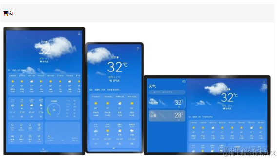
鴻蒙OS開(kāi)發(fā):【一次開(kāi)發(fā),多端部署】(一多天氣)項(xiàng)目
鴻蒙OS開(kāi)發(fā):【一次開(kāi)發(fā),多端部署】(音樂(lè)專(zhuān)輯主頁(yè))
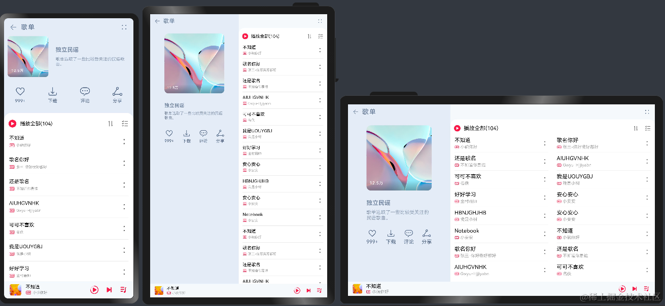
鴻蒙OS開(kāi)發(fā):【一次開(kāi)發(fā),多端部署】(音樂(lè)專(zhuān)輯頁(yè)面)
鴻蒙OS開(kāi)發(fā):【一次開(kāi)發(fā),多端部署】(視頻應(yīng)用)
鴻蒙OS開(kāi)發(fā):【一次開(kāi)發(fā),多端部署】(布局能力簡(jiǎn)介)
鴻蒙OS開(kāi)發(fā):典型頁(yè)面場(chǎng)景【一次開(kāi)發(fā),多端部署】實(shí)戰(zhàn)(音樂(lè)專(zhuān)輯頁(yè)2)
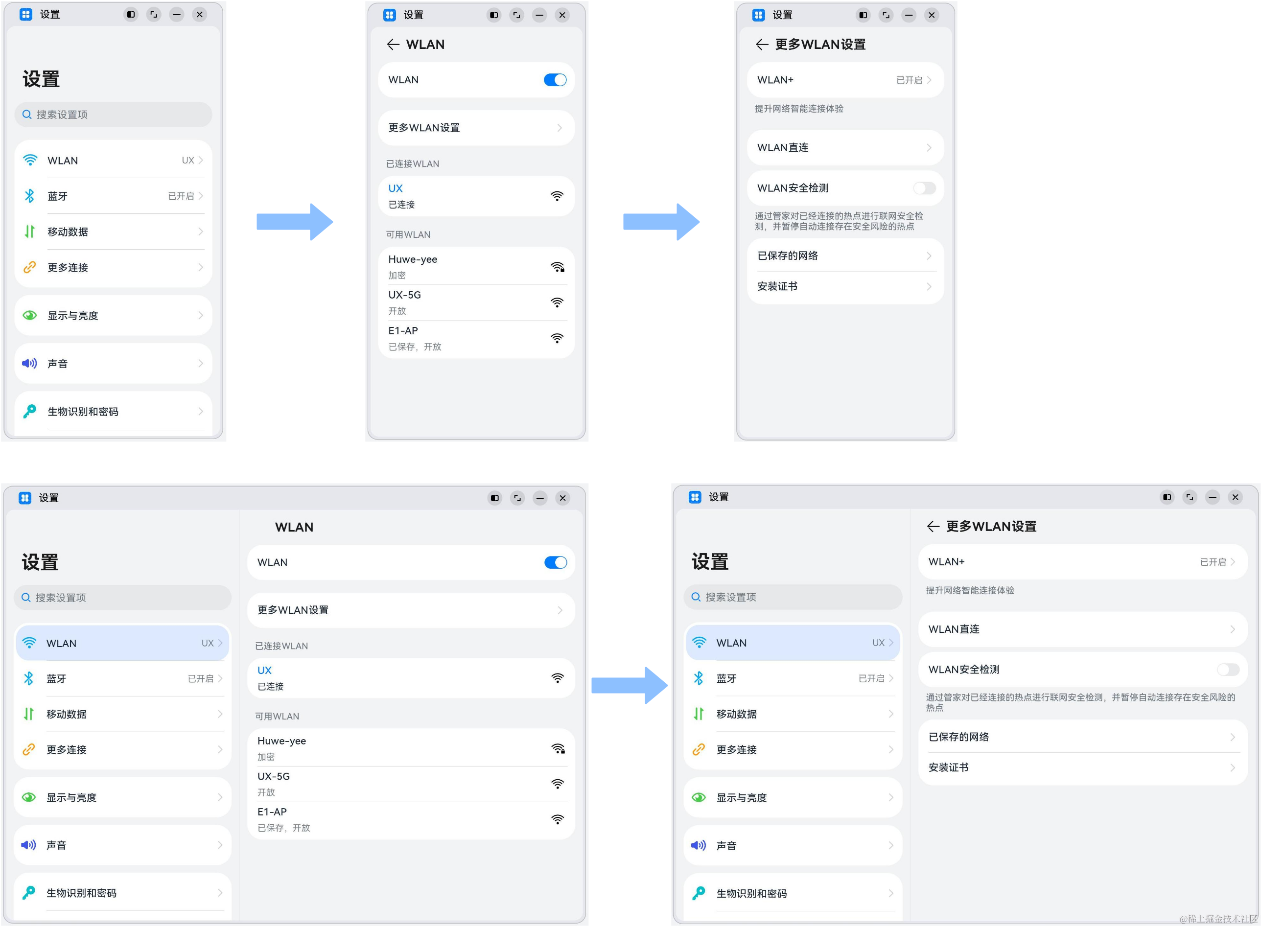
鴻蒙OS開(kāi)發(fā):典型頁(yè)面場(chǎng)景【一次開(kāi)發(fā),多端部署】實(shí)戰(zhàn)(設(shè)置典型頁(yè)面)
HarmonyOS\"一次開(kāi)發(fā),多端部署\"優(yōu)秀實(shí)踐——玩機(jī)技巧,碼上起航
華為開(kāi)發(fā)者大會(huì)2021:一次開(kāi)發(fā) 多端部署

華為開(kāi)發(fā)者大會(huì)2021:軟件部總裁龔體 鴻蒙系統(tǒng) 一次開(kāi)發(fā) 多端部署 萬(wàn)物互連

鴻蒙OS開(kāi)發(fā):【一次開(kāi)發(fā),多端部署】(多設(shè)備自適應(yīng)能力)簡(jiǎn)單介紹
鴻蒙OS開(kāi)發(fā):【一次開(kāi)發(fā),多端部署】( 設(shè)置app頁(yè)面)


 工商網(wǎng)監(jiān)
評(píng)論