 鴻蒙OS開發:典型頁面場景【一次開發,多端部署】(短信)案例介紹
一多開發實例(短信)
本章從系統預置的應用中,選擇短信應用作為典型的案例,從頁面開發和工程結構的角度,介紹"一多"的具體實踐。系統的產品形態在不斷豐富中,當前主要有默認設備和平板兩種產品形態,本章的具體實踐也將圍繞這兩種產品形態展開。
概覽
短信是系統中預置的應用,主要包含信息查看、發送短信、接收短信、短信送達報告、刪除短信等功能。在不同類型設備上,短信應用的功能完全相同,故短信應用適合使用[部署模型A](即:不同類型的設備上安裝運行相同的HAP或HAP組合)。
本案例中,在會話詳情頁面利用[方舟開發框架]提供的“一多”能力,用一套代碼同時適配默認設備和平板。
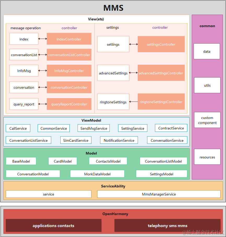
工程結構
短信應用的工程結構如下圖所示,當前該應用的功能較少,所以直接使用了DevEco Studio創建出的默認工程結構。具體采用何種形式的工程結構,并不影響應用的開發。但是使用推薦的工程結構,目錄結構更清晰,拓展性也更好。
短信應用UI相關的邏輯集中在views和pages兩個目錄,分別存放公共組件及頁面。當前短信應用主要包含如下頁面:
- 信息列表頁面:首頁,展示信息列表。
- 通知信息列表頁面:將通知類信息集中在一起展示,與信息列表頁面類似。
- 會話詳情頁面:展示與某聯系人的所有信息往來。
- 報告詳情頁面:信息發送報告的詳情頁面。
- 設置頁面:消息設置頁面,如是否展示送達報告等。
- 開發前請熟悉鴻蒙開發指導文檔 :[
gitee.com/li-shizhen-skin/harmony-os/blob/master/README.md]
/Mms/
 ├── doc                                        # 資料
 ├── entry
 │   └── src
 │       └── main
 │           ├── resources                      # 資源配置文件存放目錄
 │           ├── config.json                    # 全局配置文件
 │           └── ets                            # ets代碼目錄
 │               ├── ServiceAbility             # 后臺常駐服務
 │               └── default                    # 業務代碼目錄
 │                   ├── data                   # 自定義數據類型
 │                   ├── model                  # 對接數據庫
 │                   ├── pages                  # 所有頁面
 │                   │   ├── conversation       # 會話詳情頁面
 │                   │   ├── conversationlist   # 信息列表頁面
 │                   │   ├── index              # 初始頁面
 │                   │   ├── info_msg           # 通知信息列表頁面
 │                   │   ├── query_report       # 報告詳情頁面
 │                   │   └── settings           # 設置頁面
 │                   ├── service                # 業務邏輯
 │                   ├── utils                  # 工具類
 │                   ├── views                  # 自定義組件
 │                   └── app.ets                # 應用生命周期
 ├── signs                                      # 簽名
 └── LICENSE
短信應用在開發階段,采用了一層工程結構。由于功能較為簡單,所以并沒有規劃共用的feature和common目錄,僅采用了一層product目錄。
- 業務形態層(product) 該目錄采用IDE工程默認創建的entry目錄,開發者可根據需要在創建Module時自行更改該目錄名。不同產品形態,編譯出相同的短信HAP。
會話詳情頁面
頁面結構
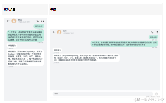
會話詳情頁面在默認設備和平板上的樣式如上圖所示,會話詳情頁面可以劃分為三個部分:

接下來我們詳細介紹各部分的實現。
說明: 為了方便理解,我們對會話詳情頁面做了一定的精簡,本小節僅介紹會話詳情頁面最基礎的實現。
頂部標題欄

頂部標題欄是一個簡單的行布局,包含返回圖標、聯系人頭像、聯系人姓名和號碼、撥號圖標、設置圖標共5個元素。其中,聯系人姓名和號碼以列布局的形式放在一起。
在默認設備和平板上,頂部標題欄的組件結構是相同的,僅聯系人姓名和號碼與撥號圖標的間距不同。回顧方舟開發框架一多能力介紹,這個場景可以借助Blank組件使用拉伸能力。
我們先實現聯系人姓名和號碼,用Flex組件作為父容器,其包含兩個Text子組件,分別用于存放聯系人姓名和號碼。Flex組件的屬性設置如下:
- direction: FlexDirection.Column:子組件在Flex容器上以列的方式排布,即主軸是垂直方向。
- justifyContent: FlexAlign.Center:子組件在Flex容器主軸(垂直方向)上居中對齊。
- alignItems: ItemAlign.Start:子組件在Flex容器交叉軸(水平方向)上首部對齊。
可以查看[Flex組件]及[Text組件]了解這兩個組件各個屬性的含義及詳細用法。

@Component
 struct TopArea {
   build() {
     Flex({ direction: FlexDirection.Column, justifyContent: FlexAlign.Center,
       alignItems: ItemAlign.Start}) {
       Text('張三').fontSize(16).fontColor("#182431")
       Text('+123 4567 8901').fontSize(14).fontColor("#66182431")
     }
   }
 }
接下來我們通過width屬性和height屬性設置四個圖標的寬高,并將它們與聯系人姓名和電話以及Blank組件一起放到Flex父容器中。為了便于查看效果,對頂部標題欄設置了淡藍色的背景色。

@Component
 struct TopArea {
   build() {
     Flex({ alignItems: ItemAlign.Center }) {
       Image($r('app.media.back'))
         .width(24)
         .height(24)
       Image($r('app.media.contact'))
         .width(40)
         .height(40)
       Flex({ direction: FlexDirection.Column, justifyContent: FlexAlign.Center,
         alignItems: ItemAlign.Start}) {
         Text('張三').fontSize(16).fontColor("#182431")
         Text('+123 4567 8901').fontSize(14).fontColor("#66182431")
       }
       Blank()                  // 拉伸能力
       Image($r("app.media.phone"))
         .width(24)
         .height(24)
       Image($r('app.media.dots'))
         .width(24)
         .height(24)
     }
     .width('100%')
     .height(56)
     .backgroundColor('#87CEFA')  // 頂部標題欄背景色,僅用于開發測試
   }
 }
當前標題欄中子組件的布局同預期還有些差異,接下來通過margin屬性,設置各個元素的左右間距。如下圖所示,最終頂部工具欄在默認設備和平板上都可以達到預期顯示效果。

@Component
 struct TopArea {
   build() {
     Flex({ alignItems: ItemAlign.Center }) {
       Image($r('app.media.back'))
         .width(24)
         .height(24)
         .margin({ left:24 })             // 設置間距
       Image($r('app.media.contact'))
         .width(40)
         .height(40)
         .margin({ left:16, right:16 })  // 設置間距
       Flex({ direction: FlexDirection.Column, justifyContent: FlexAlign.Center,
         alignItems: ItemAlign.Start}) {
         Text('張三').fontSize(16).fontColor("#182431")
         Text('+123 4567 8901').fontSize(14).fontColor("#66182431")
       }
       Blank()
       Image($r("app.media.phone"))
         .width(24)
         .height(24)
       Image($r('app.media.dots'))
         .width(24)
         .height(24)
         .margin({ left:16, right:24 })  // 設置間距
     }
     .width('100%')
     .height(56)
     .backgroundColor('#87CEFA')           // 頂部標題欄背景色,僅用于開發測試
   }
 }
底部輸入欄
有了頂部工具欄的開發經驗,可以發現底部輸入欄的結構更為簡單,它同樣以Flex組件作為父容器,同時包含文本輸入框)和消息發送圖標兩個子節點。

為了便于查看的效果,我們同樣給底部輸入欄設置了淡藍色到背景色。注意這里有一個特殊的地方,我們給TextArea設置了flexGrow(1)屬性。flexGrow屬性僅在父組件是Flex組件時生效,表示Flex容器的剩余空間分配給此屬性所在的組件的比例,flexGrow(1)表示父容器的剩余空間全部分配給此組件。

@Component
 struct BottomArea {
   build() {
     Flex({ direction: FlexDirection.Row, alignItems: ItemAlign.Center, justifyContent: FlexAlign.Center }) {
       TextArea({ placeholder:'短信' })
         .placeholderColor("#99000000")
         .caretColor("#007DFF")
         .backgroundColor("#F1F3F5")
         .borderRadius(20)
         .height(40)
         .flexGrow(1)           // 將父容器的剩余空間全部分配給此組件

       Image($r("app.media.send"))
         .height(36)
         .width(36)
         .opacity(0.4)
         .margin({ left:12 })
     }
     .height(72)
     .width('100%')
     .padding({ left:24, right:24, bottom:8, top:8 })
     .backgroundColor('#87CEFA')  // 底部輸入欄背景色,僅用于開發測試
   }
 }
信息列表
觀察信息列表區域,可以發現它是由一個個消息氣泡組成的,另外消息氣泡在默認設備和平板上的布局有差異。本小節將圍繞如下兩個主題介紹如何實現消息列表。
- 如何實現自定義消息氣泡組件。
- 如何在默認設備和平板上自適應布局。

消息氣泡
先做一個最簡單的消息氣泡,通過borderRadius屬性可以設置邊框的圓角半徑。

@Component
struct MessageBubble {
  private content: string = "Introduction"

  build() {
    Column() {
      Flex({ alignItems: ItemAlign.Center, justifyContent: FlexAlign.End }) {
        Text(this.content)
            .fontSize(16)
            .lineHeight(21)
            .padding({ left: 12, right: 12, top: 8, bottom: 8 })
            .backgroundColor("#C0EBDF")
            .borderRadius(24)
            .fontColor("#182431")
      }.width('100%')
    }
    .margin({left: 24, right: 24 })
    .backgroundColor('#87CEFA')  // 消息背景色,僅用于開發和測試
  }
}
注意這個簡單的消息氣泡,左上角(或右上角)的樣式,與實際期望不符。我們先修改發送消息右上角的樣式,接收消息左上角的實現與之類似。
[Stack組件]是一個堆疊容器,其子組件按照軸方向依次堆疊,后一個子組件覆蓋前一個子組件。通過其alignContent接口,可以設置子組件在容器內的對齊方式,如alignContent: Alignment.TopStart代表子組件從左上角對齊。

@Component
struct MessageBubble {
  private content: string = "Introduction"

  build() {
    Column() {
      Flex({ alignItems: ItemAlign.Center, justifyContent: FlexAlign.End }) {
        Stack({ alignContent: Alignment.TopEnd }) {  // 在左上角堆疊一個小色塊
          Column()
            .backgroundColor("#C0EBDF")
            .borderRadius(4)
            .width(24)
            .height(24)
          Text(this.content)
            .fontSize(16)
            .lineHeight(21)
            .padding({ left: 12, right: 12, top: 8, bottom: 8 })
            .backgroundColor("#C0EBDF")
            .borderRadius(24)
            .fontColor("#182431")
        }
      }.width('100%')
    }
    .margin({left: 24, right: 24 })
    .backgroundColor('#87CEFA')  // 消息背景色,僅用于開發和測試
  }
}
接下來我們在消息氣泡下方加上時間顯示,如下圖所示,一個消息氣泡自定義組件就基本完成了。

@Component
struct MessageBubble {
  private content: string = "Introduction"
  private time: string = "上午 10:35"

  build() {
    Column() {
      Flex({ alignItems: ItemAlign.Center, justifyContent: FlexAlign.End }) {
        Stack({ alignContent: Alignment.TopEnd }) {
          Column()
            .backgroundColor("#C0EBDF")
            .borderRadius(4)
            .width(24)
            .height(24)
          Text(this.content)
            .fontSize(16)
            .lineHeight(21)
            .padding({ left: 12, right: 12, top: 8, bottom: 8 })
            .backgroundColor("#C0EBDF")
            .borderRadius(24)
            .fontColor("#182431")
        }
      }.width('100%')

      // 在消息氣泡底部增加時間顯示
      Flex({ alignItems: ItemAlign.Center, direction: FlexDirection.Row,
        justifyContent: FlexAlign.End}) {
        Text(this.time)
          .textAlign(TextAlign.Start)
          .fontSize(10)
          .lineHeight(13)
          .fontColor("#99182431")
      }.width('100%').margin({ left: 12, right: 24 })
    }
    .margin({left: 24, right: 24 })
    .backgroundColor('#87CEFA')  // 消息背景色,僅用于開發和測試
  }
}
發送出的消息和接收到的消息的消息氣泡結構基本一致,可以通過增加一個標志位,讓兩種消息共用MessageBubble這個自定義組件,代碼如下所示。將這個標志位設置true,可以查看接收消息的效果。

@Component
 struct MessageBubble {
   private isReceived:boolean = true// 通過標志位,判斷是發送or接收場景,進而使用不同的樣式
   private content:string = "Introduction"
   private time:string = "今天 10:35"

   build() {
     Column() {
       Flex({ justifyContent:this.isReceived? FlexAlign.Start: FlexAlign.End,
         alignItems: ItemAlign.Center }) {
         Stack({ alignContent:this.isReceived? Alignment.TopStart: Alignment.TopEnd }) {
           Column()
             .backgroundColor(this.isReceived?"#FFFFFF":"#C0EBDF")
             .borderRadius(4)
             .width(24)
             .height(24)
           Text(this.content)
             .fontSize(16)
             .lineHeight(21)
             .padding({ left:12, right:12, top:8, bottom:8 })
             .backgroundColor(this.isReceived?"#FFFFFF":"#C0EBDF")
             .borderRadius(24)
             .fontColor("#182431")
         }
       }.width('100%')

       Flex({ alignItems: ItemAlign.Center, direction: FlexDirection.Row,
         justifyContent:this.isReceived? FlexAlign.Start: FlexAlign.End }) {
         Text(this.time)
           .textAlign(TextAlign.Start)
           .fontSize(10)
           .lineHeight(13)
           .fontColor("#99182431")
       }.width('100%')
       .margin({ left:this.isReceived?12:0, right:this.isReceived?0:12 })
     }
     .margin({left:24, right:24 })
     .backgroundColor('#87CEFA')  // 消息背景色,僅用于開發和測試
   }
 }
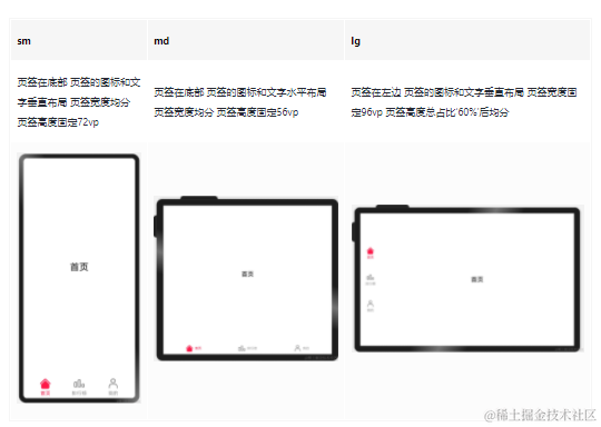
柵格布局
回顧方舟開發框架一多能力,消息氣泡在默認設備和平板上布局不同,可以借助柵格布局來解決。為了方便測試,我們預定義一個全局數組。
interface globalMessageItem {
    time:string,
    content:string,
    isReceived:boolean
 }

const globalMessageList:globalMessageItem[] = [
  {
    time:'上午 10:20',
    content:'項目介紹',
    isReceived:false
  },
  {
    time:'上午 10:28',
    content:'"一次開發,多端部署"支撐開發者快速高效的開發支持多種終端設備形態的應用,實現對不同設備兼容的同時,提供跨設備的流轉、遷移和協同的分布式體驗',
    isReceived:false
  },
  {
    time:'上午 10:32',
    content:'系統能力',
    isReceived:true
  },
  {
    time:'上午 10:35',
    content:'系統能力(即SystemCapability,縮寫為SysCap)指操作系統中每一個相對獨立的特性,如藍牙,WIFI,NFC,攝像頭等,都是系統能力之一。每個系統能力對應多個API,隨著目標設備是否支持該系統能力共同存在或消失。',
    isReceived:true
  }
]
結合[柵格組件]的定義,考慮我們當前的實際場景,GridRow的各參數設置如下。
- columns:柵格組件中的列數,當前場景默認12列即可。
- gutter:柵格布局列間距,當前場景未使用該參數,默認設置為0即可。
- margin: 柵格布局兩側間距,在開發消息氣泡組件時,已經設置了左右間距,故該屬性也默認配置為0。
柵格中僅包含我們自定義的消息氣泡組件,該組件在各斷點上的參數配置如下。
| 斷點 | 窗口寬度(vp) | 柵格總列數 | 消息氣泡占用的列數 | 接收場景偏移的列數 | 發送場景偏移的列數 |
|---|---|---|---|---|---|
| sm | [320, 600) | 12 | 12 | 0 | 0 |
| md | [600, 840) | 12 | 8 | 0 | 4 |
| lg | [840, +∞) | 12 | 8 | 0 | 4 |

@Component
export default struct MessageItem {
  private isReceived?: boolean
  private content?: string
  private time?: string

  build() {
    GridRow() {
      GridCol({span: {sm: 12, md: 8, lg: 8},
        offset: {sm: 0, md: this.isReceived? 0 : 4, lg: this.isReceived? 0 : 4}}) {
        Flex({ justifyContent: FlexAlign.End, alignItems: ItemAlign.End }) {
          MessageBubble({
            isReceived: this.isReceived,
            content: this.content,
            time: this.time
          })
        }
      }
    }
  }
}

@Entry
@Component
struct Conversation {
  build() {
    Column() {                      // 驗證效果
       MessageItem({
        isReceived: globalMessageList[1].isReceived,
        content: globalMessageList[1].content,
        time: globalMessageList[1].time
      })
      MessageItem({
        isReceived: globalMessageList[3].isReceived,
        content: globalMessageList[3].content,
        time: globalMessageList[3].time
      })
    }.backgroundColor('#87CEFA')    // 消息背景色,僅用于開發和測試
  }
}
組合成型
現在會話詳情頁面的頂部標題欄、信息列表及底部輸入欄都已經準備完畢,將這三部分組合起來即可得到完整的頁面。
- 通過[Flex組件]將三個部分組合起來,注意justifyContent: FlexAlign.SpaceBetween配置項是將Flex組件中的元素按照主軸方向均勻分配,其中第一個元素與頂部對齊,最后一個元素與底部對齊。
- 通過[List組件]和[ForEach語法],顯示整個消息列表。

`HarmonyOS與OpenHarmony鴻蒙文檔籽料:mau123789是v直接拿`

@Entry
 @Component
 struct Conversation {
   build() {
     Flex({ direction: FlexDirection.Column, alignItems: ItemAlign.Start,
       justifyContent: FlexAlign.SpaceBetween }) {
       Column() {
         TopArea()   // 頂部標題欄
         List() {    // 消息列表
           ForEach(globalMessageList, (item:globalMessageItem, index) = > {
             ListItem() {
               MessageItem({
                 isReceived: item.isReceived,
                 content: item.content,
                 time: item.time
               })
           }})
         }
         .listDirection(Axis.Vertical)
         .edgeEffect(EdgeEffect.Spring)
       }
       BottomArea()  // 底部輸入欄
     }
     .backgroundColor("#F1F3F5")
     .width('100%')
     .height('100%')
   }
 }
短信應用在默認設備和平板上的功能完全相同,因此選擇了部署模型A。借助方舟開發框架一多能力,短信應用實現了在默認設備和平板上共用同一份代碼,同時自然也共用安裝包。
在實際開發過程中,會話詳情頁面需要從底層做數據交互,同時還要支持信息選擇、信息刪除、信息發送狀態、輸入框與輸入法聯動等等功能,會比本小節中介紹的基礎版本復雜很多。
審核編輯 黃宇
-
鴻蒙
+關注
關注
57文章
2392瀏覽量
43050 -
鴻蒙OS
+關注
關注
0文章
190瀏覽量
4537
發布評論請先 登錄
相關推薦
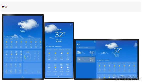
鴻蒙OS開發:【一次開發,多端部署】(一多天氣)項目
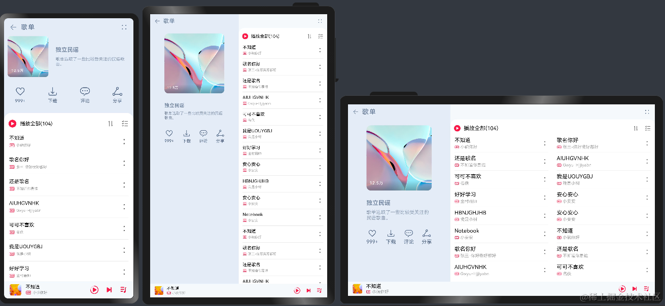
鴻蒙OS開發:【一次開發,多端部署】(音樂專輯主頁)
鴻蒙OS開發:【一次開發,多端部署】(典型布局場景)
鴻蒙OS開發:典型頁面場景【一次開發,多端部署】實戰(音樂專輯頁2)
鴻蒙OS開發:典型頁面場景【一次開發,多端部署】(設置應用頁面)
鴻蒙OS開發:典型頁面場景【一次開發,多端部署】實戰(設置典型頁面)
鴻蒙OS開發:典型頁面場景【一次開發,多端部署】(資源使用)
鴻蒙OS開發:典型頁面場景【一次開發,多端部署】(信息應用)案例
鴻蒙OS開發:【一次開發,多端部署】( 設置app頁面)
鴻蒙OS開發:典型頁面場景【一次開發,多端部署】(功能開發)


 工商網監
工商網監
評論