 鴻蒙ArkTS聲明式開發:跨平臺支持列表【位置設置】 通用屬性
位置設置
設置組件的對齊方式、布局方向和顯示位置。
說明:
開發前請熟悉鴻蒙開發指導文檔 :[gitee.com/li-shizhen-skin/harmony-os/blob/master/README.md]
從API Version 7開始支持。后續版本如有新增內容,則采用上角標單獨標記該內容的起始版本。
屬性
| 名稱 | 參數類型 | 描述 |
|---|---|---|
| align | [Alignment] | 設置元素內容在元素繪制區域內的對齊方式。 只在Stack、Button、Marquee、StepperItem、text、TextArea、TextInput中生效,其中和文本相關的組件Marquee、text、TextArea、TextInput的align結果參考[textAlign]。 不支持textAlign屬性的組件則無法設置水平方向的文字對齊。 默認值:Alignment.Center 從API version 9開始,該接口支持在ArkTS卡片中使用。 |
| direction | [Direction] | 設置元素水平方向的布局。 默認值:Direction.Auto 從API version 9開始,該接口支持在ArkTS卡片中使用。 |
| position | [Position] | 絕對定位,設置元素左上角相對于父容器左上角偏移位置。在布局容器中,設置該屬性不參與父容器布局,即不占位,僅在繪制時進行位置調整。 適用于置頂顯示、懸浮按鈕等組件在父容器中位置固定的場景。 從API version 9開始,該接口支持在ArkTS卡片中使用。 |
| markAnchor | [Position] | 設置元素在位置定位時的錨點,以元素左上角作為基準點進行偏移。通常配合position和offset屬性使用,單獨使用時,效果類似offset API version 9及以前,默認值為: { x: 0, y: 0 } API version 10:無默認值。 從API version 9開始,該接口支持在ArkTS卡片中使用。 |
| offset | [Position] | 相對定位,設置元素相對于自身的偏移量。設置該屬性后子組件正常參與父容器布局,在繪制時基于父容器給予的offset做一次額外的偏移。 API version 9及以前,默認值為: { x: 0, y: 0 } API version 10:無默認值。 從API version 9開始,該接口支持在ArkTS卡片中使用。 |
| alignRules9+ | { left?: { anchor: string, align: [HorizontalAlign] }; right?: { anchor: string, align: [HorizontalAlign] }; middle?: { anchor: string, align: [HorizontalAlign] }; top?: { anchor: string, align: [VerticalAlign] }; bottom?: { anchor: string, align: [VerticalAlign] }; center?: { anchor: string, align: [VerticalAlign] } } | 指定相對容器的對齊規則,僅當父容器為[RelativeContainer]時生效。 - left:設置左對齊參數。 - right:設置右對齊參數。 - middle:設置中間對齊的參數。 - top:設置頂部對齊的參數。 - bottom:設置底部對齊的參數。 - center:設置中心對齊的參數。 該接口支持在ArkTS卡片中使用。說明:- anchor:設置作為錨點的組件的id值。 - align:設置相對于錨點組件的對齊方式。 |
示例
示例1
// xxx.ets
@Entry
@Component
struct PositionExample1 {
build() {
Column() {
Column({ space: 10 }) {
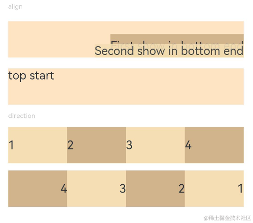
// 元素內容< 元素寬高,設置內容在與元素內的對齊方式
Text('align').fontSize(9).fontColor(0xCCCCCC).width('90%')
Stack() {
Text('First show in bottom end').height('65%').backgroundColor(0xD2B48C)
Text('Second show in bottom end').backgroundColor(0xF5DEB3).opacity(0.9)
}.width('90%').height(50).margin({ top: 5 }).backgroundColor(0xFFE4C4)
.align(Alignment.BottomEnd)
Stack() {
Text('top start')
}.width('90%').height(50).margin({ top: 5 }).backgroundColor(0xFFE4C4)
.align(Alignment.TopStart)
// 父容器設置direction為Direction.Ltr,子元素從左到右排列
Text('direction').fontSize(9).fontColor(0xCCCCCC).width('90%')
Row() {
Text('1').height(50).width('25%').fontSize(16).backgroundColor(0xF5DEB3)
Text('2').height(50).width('25%').fontSize(16).backgroundColor(0xD2B48C)
Text('3').height(50).width('25%').fontSize(16).backgroundColor(0xF5DEB3)
Text('4').height(50).width('25%').fontSize(16).backgroundColor(0xD2B48C)
}
.width('90%')
.direction(Direction.Ltr)
// 父容器設置direction為Direction.Rtl,子元素從右到左排列
Row() {
Text('1').height(50).width('25%').fontSize(16).backgroundColor(0xF5DEB3).textAlign(TextAlign.End)
Text('2').height(50).width('25%').fontSize(16).backgroundColor(0xD2B48C).textAlign(TextAlign.End)
Text('3').height(50).width('25%').fontSize(16).backgroundColor(0xF5DEB3).textAlign(TextAlign.End)
Text('4').height(50).width('25%').fontSize(16).backgroundColor(0xD2B48C).textAlign(TextAlign.End)
}
.width('90%')
.direction(Direction.Rtl)
}
}
.width('100%').margin({ top: 5 })
}
}
示例2
`HarmonyOS與OpenHarmony鴻蒙文檔籽料:mau123789是v直接拿`

// xxx.ets
@Entry
@Component
struct PositionExample2 {
  build() {
    Column({ space: 20 }) {
      // 設置子組件左上角相對于父組件左上角的偏移位置
      Text('position').fontSize(12).fontColor(0xCCCCCC).width('90%')
      Row() {
        Text('1').size({ width: '30%', height: '50' }).backgroundColor(0xdeb887).border({ width: 1 }).fontSize(16)
          .textAlign(TextAlign.Center)
        Text('2 position(30, 10)')
          .size({ width: '60%', height: '30' })
          .backgroundColor(0xbbb2cb)
          .border({ width: 1 })
          .fontSize(16)
          .align(Alignment.Start)
          .position({ x: 30, y: 10 })
        Text('3').size({ width: '45%', height: '50' }).backgroundColor(0xdeb887).border({ width: 1 }).fontSize(16)
          .textAlign(TextAlign.Center)
        Text('4 position(50%, 70%)')
          .size({ width: '50%', height: '50' })
          .backgroundColor(0xbbb2cb)
          .border({ width: 1 })
          .fontSize(16)
          .position({ x: '50%', y: '70%' })
      }.width('90%').height(100).border({ width: 1, style: BorderStyle.Dashed })

      // 相對于起點偏移,其中x為最終定位點距離起點水平方向間距,x >0往左,反之向右。
      // y為最終定位點距離起點垂直方向間距,y >0向上,反之向下
      Text('markAnchor').fontSize(12).fontColor(0xCCCCCC).width('90%')
      Stack({ alignContent: Alignment.TopStart }) {
        Row()
          .size({ width: '100', height: '100' })
          .backgroundColor(0xdeb887)
        Text('text')
          .fontSize('30px')
          .textAlign(TextAlign.Center)
          .size({ width: 25, height: 25 })
          .backgroundColor(Color.Green)
          .markAnchor({ x: 25, y: 25 })
        Text('text')
          .fontSize('30px')
          .textAlign(TextAlign.Center)
          .size({ width: 25, height: 25 })
          .backgroundColor(Color.Green)
          .markAnchor({ x: -100, y: -25 })
        Text('text')
          .fontSize('30px')
          .textAlign(TextAlign.Center)
          .size({ width: 25, height: 25 })
          .backgroundColor(Color.Green)
          .markAnchor({ x: 25, y: -25 })
      }.margin({ top: 25 }).border({ width: 1, style: BorderStyle.Dashed })

      // 相對定位,x >0向右偏移,反之向左,y >0向下偏移,反之向上
      Text('offset').fontSize(12).fontColor(0xCCCCCC).width('90%')
      Row() {
        Text('1').size({ width: '15%', height: '50' }).backgroundColor(0xdeb887).border({ width: 1 }).fontSize(16)
          .textAlign(TextAlign.Center)
        Text('2  offset(15, 30)')
          .size({ width: 120, height: '50' })
          .backgroundColor(0xbbb2cb)
          .border({ width: 1 })
          .fontSize(16)
          .align(Alignment.Start)
          .offset({ x: 15, y: 30 })
        Text('3').size({ width: '15%', height: '50' }).backgroundColor(0xdeb887).border({ width: 1 }).fontSize(16)
          .textAlign(TextAlign.Center)
        Text('4 offset(-10%, 20%)')
          .size({ width: 100, height: '50' })
          .backgroundColor(0xbbb2cb)
          .border({ width: 1 })
          .fontSize(16)
          .offset({ x: '-5%', y: '20%' })
      }.width('90%').height(100).border({ width: 1, style: BorderStyle.Dashed })
    }
    .width('100%').margin({ top: 25 })
  }
}

審核編輯 黃宇
聲明:本文內容及配圖由入駐作者撰寫或者入駐合作網站授權轉載。文章觀點僅代表作者本人,不代表電子發燒友網立場。文章及其配圖僅供工程師學習之用,如有內容侵權或者其他違規問題,請聯系本站處理。
舉報投訴
-
鴻蒙
+關注
關注
57文章
2392瀏覽量
43050
發布評論請先 登錄
相關推薦
鴻蒙ArkTS聲明式開發:跨平臺支持列表【圖片邊框設置】 通用屬性
從API Version 9開始支持。后續版本如有新增內容,則采用上角標單獨標記該內容的起始版本。
鴻蒙ArkTS聲明式開發:跨平臺支持列表【按鍵事件】
按鍵事件指組件與鍵盤、遙控器等按鍵設備交互時觸發的事件,適用于所有可獲焦組件,例如Button。對于Text,Image等默認不可獲焦的組件,可以設置focusable屬性為true后使用按鍵事件。
鴻蒙ArkTS聲明式開發:跨平臺支持列表【尺寸設置】 通用屬性
從API Version 7開始支持。后續版本如有新增內容,則采用上角標單獨標記該內容的起始版本。

鴻蒙ArkTS聲明式開發:跨平臺支持列表【邊框設置】 通用屬性
從API Version 7開始支持。后續版本如有新增內容,則采用上角標單獨標記該內容的起始版本。
鴻蒙ArkTS聲明式開發:跨平臺支持列表【背景設置】 通用屬性
從API Version 7開始支持。后續版本如有新增內容,則采用上角標單獨標記該內容的起始版本。
鴻蒙ArkTS聲明式開發:跨平臺支持列表【透明度設置】 通用屬性
從API Version 7開始支持。后續版本如有新增內容,則采用上角標單獨標記該內容的起始版本。
鴻蒙ArkTS聲明式開發:跨平臺支持列表【顯隱控制】 通用屬性
控制當前組件顯示或隱藏。注意,即使組件處于隱藏狀態,在頁面刷新時仍存在重新創建過程,因此當對性能有嚴格要求時建議使用[條件渲染]代替。 默認值:Visibility.Visible 從API version 9開始,該接口支持在ArkTS卡片中使用。
鴻蒙ArkTS聲明式開發:跨平臺支持列表【形狀裁剪】 通用屬性
參數為相應類型的組件,按指定的形狀對當前組件進行裁剪;參數為boolean類型時,設置是否按照父容器邊緣輪廓進行裁剪。 默認值:false 從API version 9開始,該接口支持在ArkTS卡片中使用。
鴻蒙ArkTS聲明式開發:跨平臺支持列表【柵格設置】 通用屬性
默認占用列數,指useSizeType屬性沒有設置對應尺寸的列數(span)時,占用的柵格列數。
鴻蒙ArkTS聲明式開發:跨平臺支持列表【菜單控制】 通用屬性
為組件綁定彈出式菜單,彈出式菜單以垂直列表形式顯示菜單項,可通過長按、點擊或鼠標右鍵觸發。

鴻蒙ArkTS聲明式開發:跨平臺支持列表【多態樣式】 通用屬性
設置組件不同狀態的樣式。 從API version 9開始,該接口支持在ArkTS卡片中使用。


 工商網監
工商網監
評論